# install.packages("Stat2Data")
# install.packages("RColorBrewer")
# install.packages("jtools")
# install.packages("viridis")
# install.packages("ggthemes")

library(Stat2Data)
library(RColorBrewer)
library(jtools)
library(viridis)
library(ggthemes)
library(tidyverse)
set.seed(012922)Lesson 4 Supplement: ggplot Examples
Overview
This chapter is a supplemental chapter to Lesson 4. It contains many more ggplot2 examples and a thorough discussion of colour palettes. These examples also make use of some other R packages we haven’t seen yet. If you need some of these packages, make sure to “uncomment” the install.packages() call for the packages you need.
Data
We will be using the FirstYearGPA data set from the Stat2Data:: package. This dataset includes several continuous and categorical variables related to GPA in the first year of college. The glimpse() function is new, but it helps is take a quick glance at a data set.
data("FirstYearGPA")
glimpse(FirstYearGPA)
Rows: 219
Columns: 10
$ GPA <dbl> 3.06, 4.15, 3.41, 3.21, 3.48, 2.95, 3.60, 2.87, 3.67, 3.4…
$ HSGPA <dbl> 3.83, 4.00, 3.70, 3.51, 3.83, 3.25, 3.79, 3.60, 3.36, 3.7…
$ SATV <int> 680, 740, 640, 740, 610, 600, 710, 390, 630, 680, 380, 63…
$ SATM <int> 770, 720, 570, 700, 610, 570, 630, 570, 560, 670, 470, 67…
$ Male <int> 1, 0, 0, 0, 0, 0, 0, 0, 0, 0, 0, 0, 1, 1, 0, 0, 0, 0, 0, …
$ HU <dbl> 3.0, 9.0, 16.0, 22.0, 30.5, 18.0, 5.0, 10.0, 8.5, 16.0, 1…
$ SS <dbl> 9.0, 3.0, 13.0, 0.0, 1.5, 3.0, 19.0, 0.0, 15.5, 12.0, 7.0…
$ FirstGen <int> 1, 0, 0, 0, 0, 0, 0, 0, 0, 0, 0, 0, 0, 0, 0, 0, 0, 1, 0, …
$ White <int> 1, 1, 0, 1, 1, 1, 1, 0, 1, 1, 0, 0, 1, 1, 1, 1, 1, 1, 0, …
$ CollegeBound <int> 1, 1, 1, 1, 1, 1, 1, 0, 1, 1, 1, 1, 1, 1, 1, 1, 1, 1, 1, …Base plot
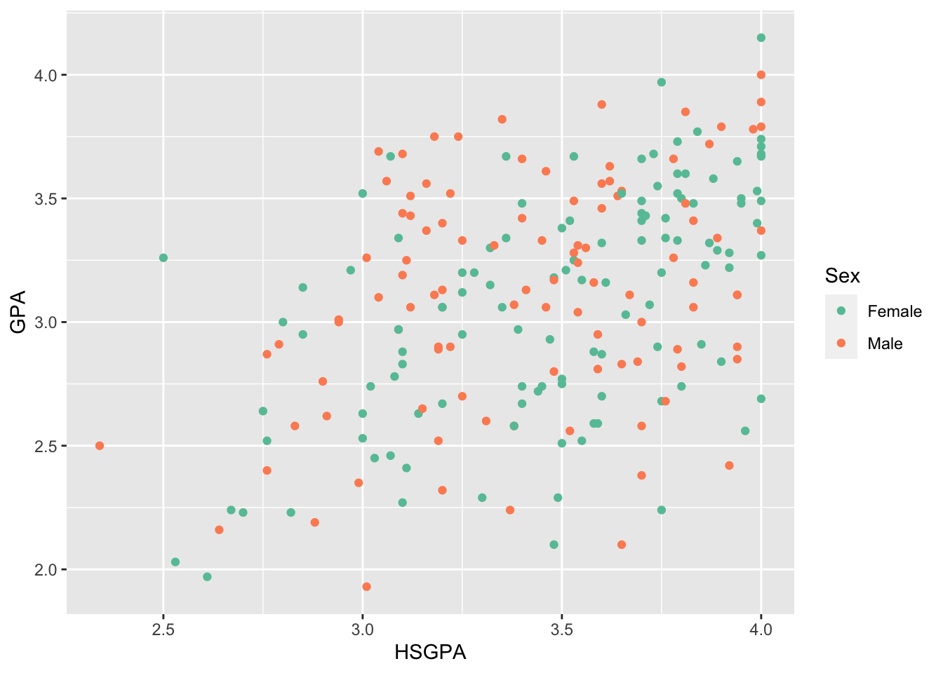
I’m going to make a plot so that we can try out some different appearance changes. I’m going to call it base_plot.
base_plot_gg <-
  ggplot(data = FirstYearGPA) +
  aes(
    x = HSGPA,
    y = GPA,
    color = as_factor(Male)
  ) +
  geom_point()

base_plot_gg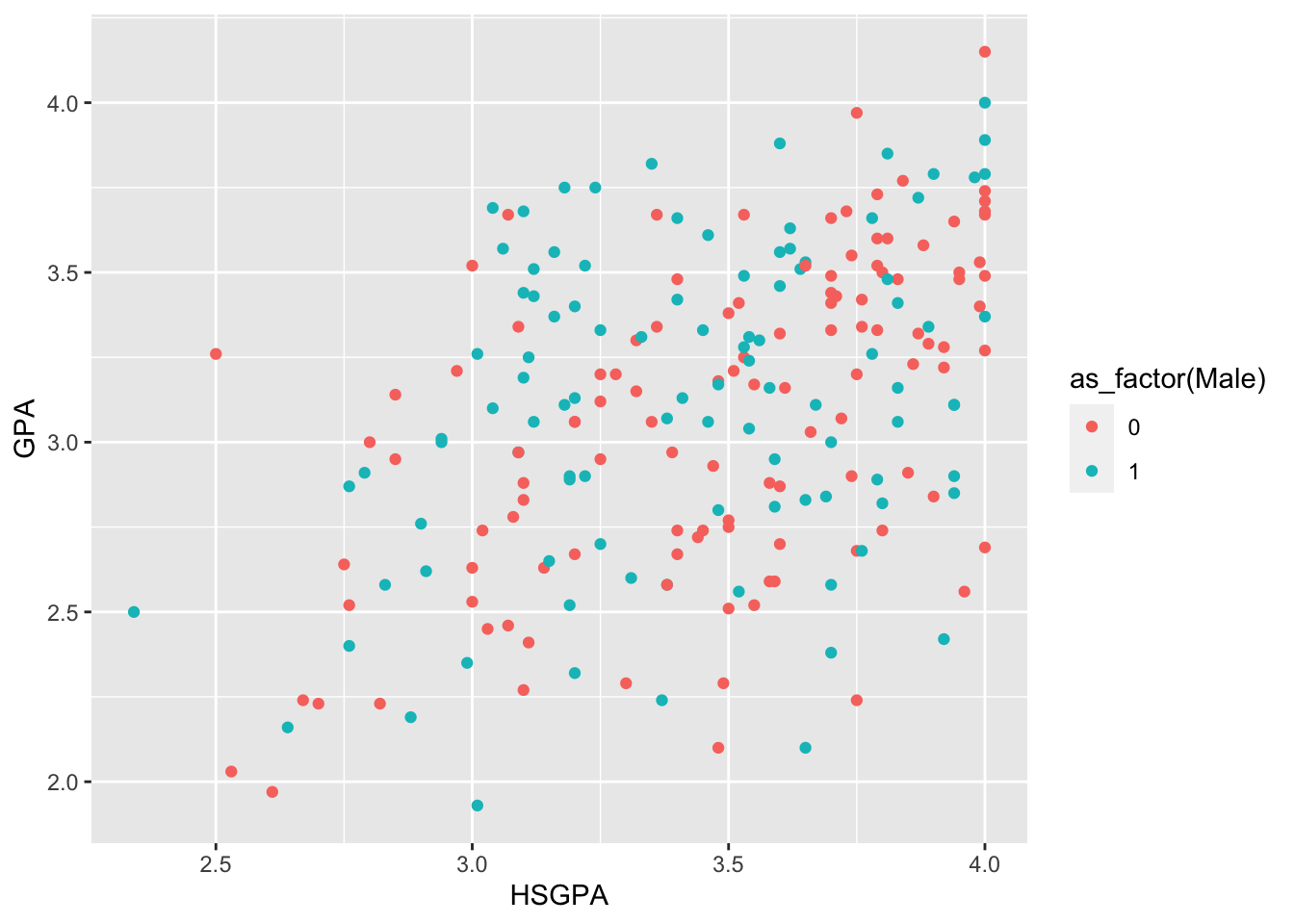
NoteExercise
Exercise
Discuss this plot with your neighbours. What do you like about this plot? What is it missing?
Tip
You can save a ggplot object by assigning it a name. Then, you can add onto this plot later. Notice that we are saving the base plot as an object (via base_plot_gg <-) so we can modify it throughout these examples. However, if we are only creating a plot to use once, there is no reason to save it as an object.
Titles, axes, and legend
Title (and related)
Give your plots informative titles. An informative title helps tell the story of the plot. Here are two examples:
BAD: Relationship between HS GPA and college GPA
GOOD: High school GPA is positively related to college GPA
Here’s a title with more information (to show how you can add additional details).
ggplot(data = FirstYearGPA) +
  aes(
    x = HSGPA,
    y = GPA,
    color = as_factor(Male)
  ) +
  labs(
    title = "High school GPA is positively related to college GPA, \nespecially for girls",
    subtitle = "Among students at X University",
    caption = "Data from FirstYearGPA in the Stat2Data package",
    tag = "Figure 1",
    alt = "Scatter plot showing the positive relationship between HS GPA and
    college GPA, colored by student gender",
    x = "High School GPA",
    y = "College GPA"
  ) +
geom_point() 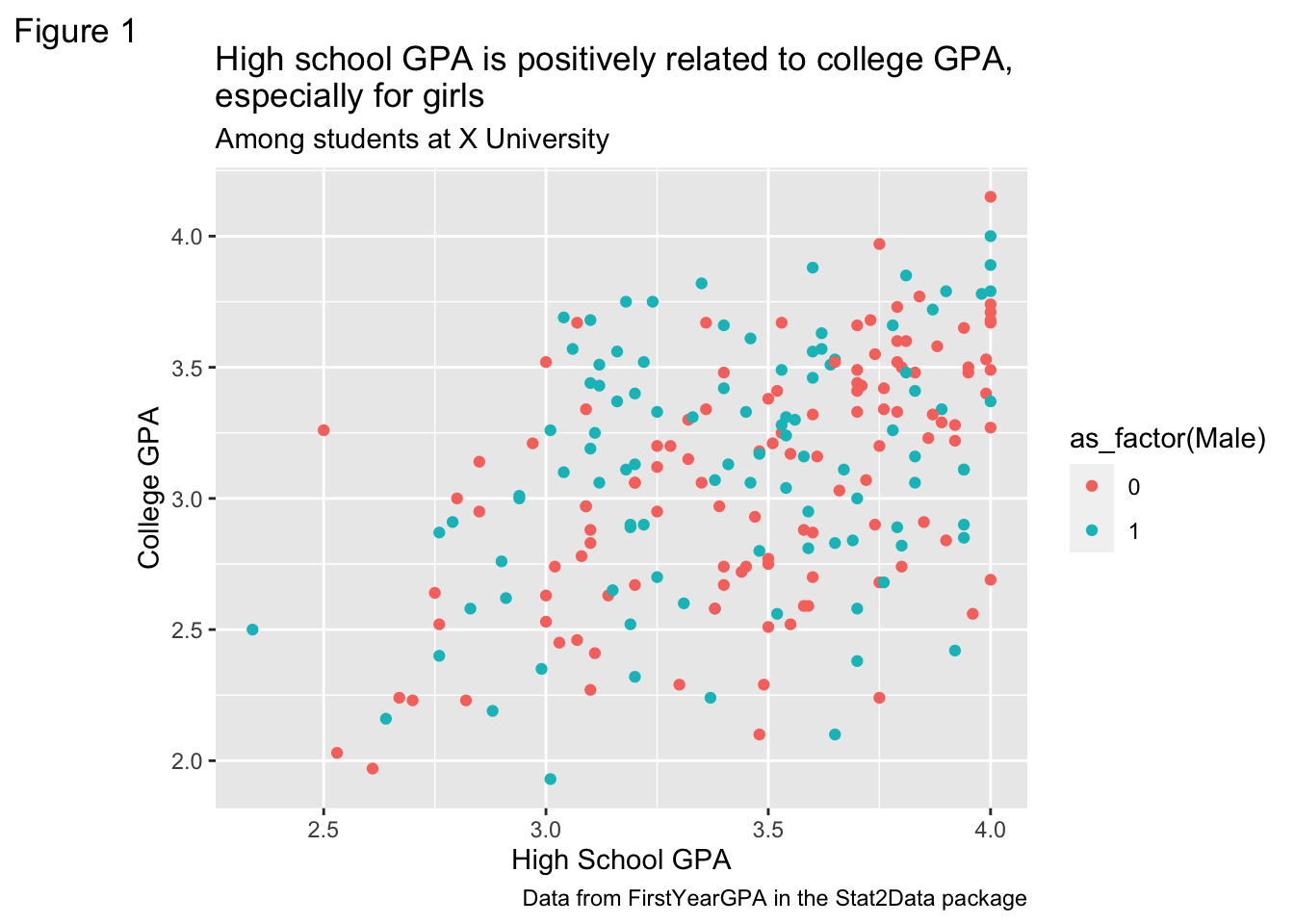
That’s a bit much, so let’s just stick with the title going forward.
ggplot(data = FirstYearGPA) +
  aes(
    x = HSGPA,
    y = GPA,
    color = as_factor(Male)
  )  +
  labs(
    title = "High school GPA is positively related to college GPA, \nespecially for girls"
  ) +
  geom_point()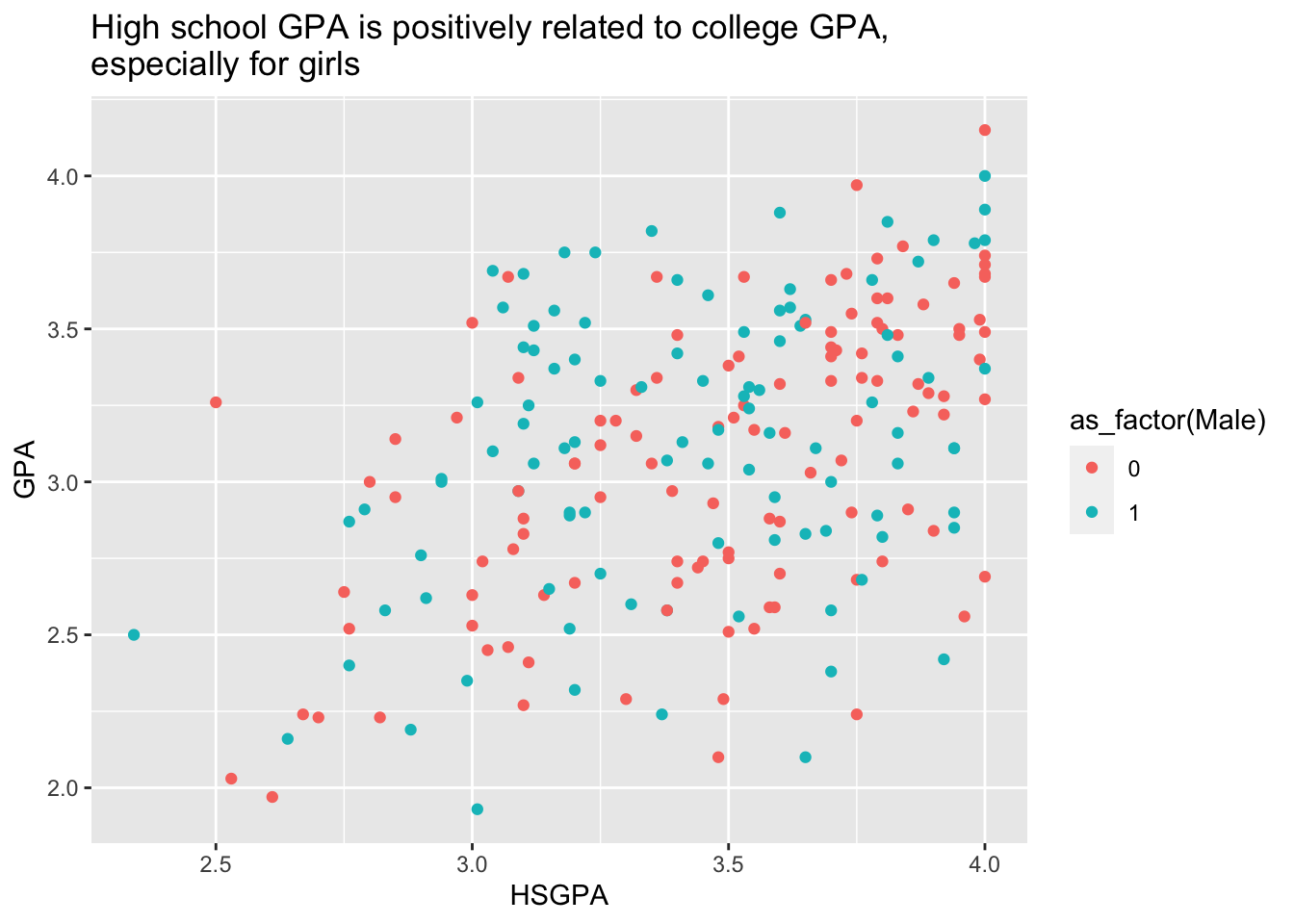
X and Y axis labels
Let’s change the X and Y axes to be more informative. These aren’t the worst named variables, but you do need to infer that GPA is probably for college. Unless you go look at the information about the dataset – but we want our plot to speak for itself.
ggplot(data = FirstYearGPA) +
  aes(
    x = HSGPA,
    y = GPA,
    color = as_factor(Male)
  )  +
  labs(
    x = "High school GPA",
    y = "First year college GPA"
  ) +
  geom_point()
You can also do this using the scale() functions:
ggplot(data = FirstYearGPA) +
  aes(
    x = HSGPA,
    y = GPA,
    color = as_factor(Male)
  ) +
  scale_x_continuous(name = "High school GPA") +
  scale_y_continuous(name = "First year college GPA") +
  geom_point()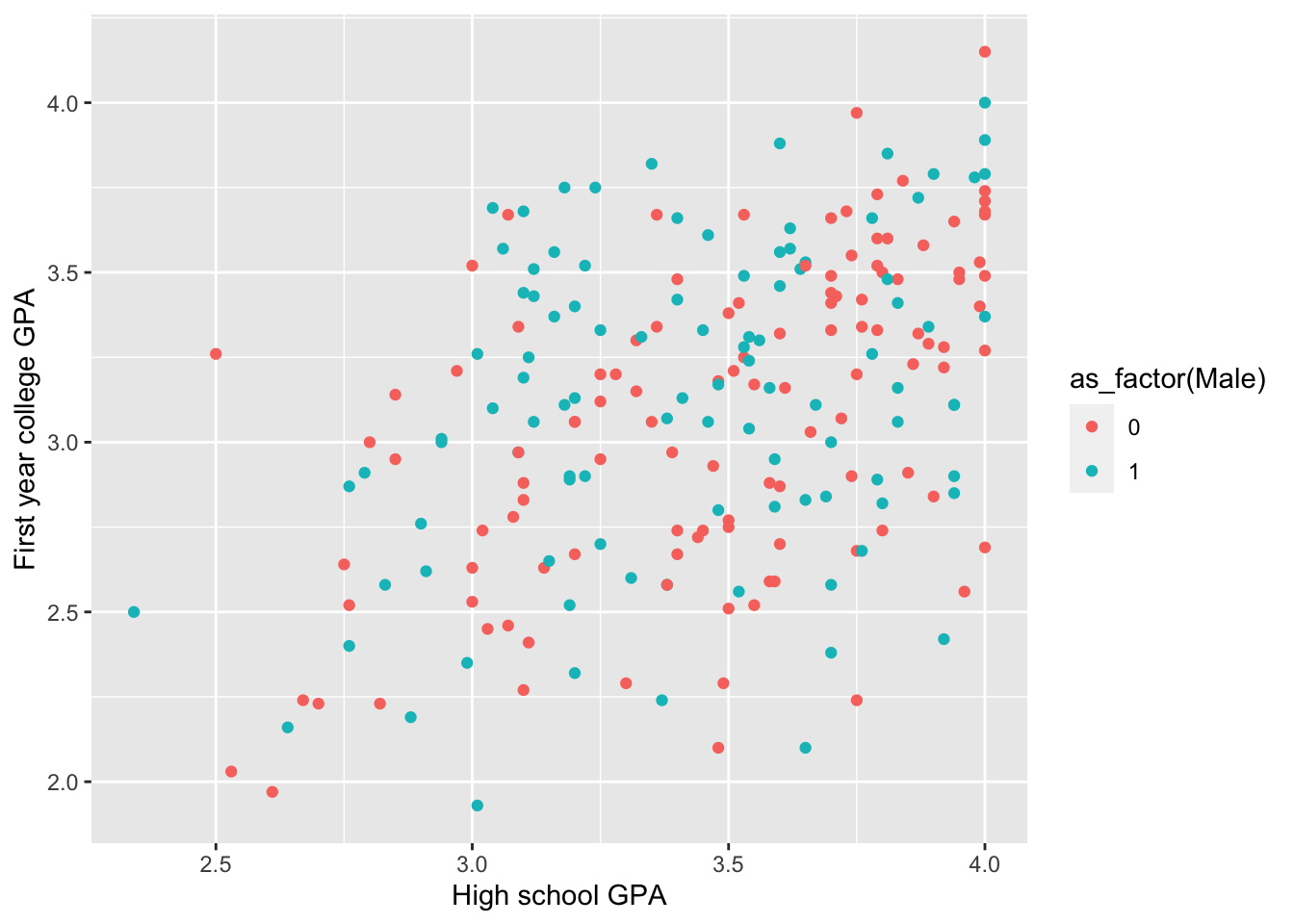
X and Y axis limits
Something else you might want to do sometimes to provide context for your plot and data is adjust the limits of the axes beyond the values of the data. In this case, it would make it easier to see if the values run the full (potential) range of the variable.
ggplot(data = FirstYearGPA) +
  aes(
    x = HSGPA,
    y = GPA,
    color = as_factor(Male)
  ) +
  xlim(0, 4) +
  ylim(0, 4) +
  geom_point()
Warning: Removed 1 row containing missing values or values outside the scale range
(`geom_point()`).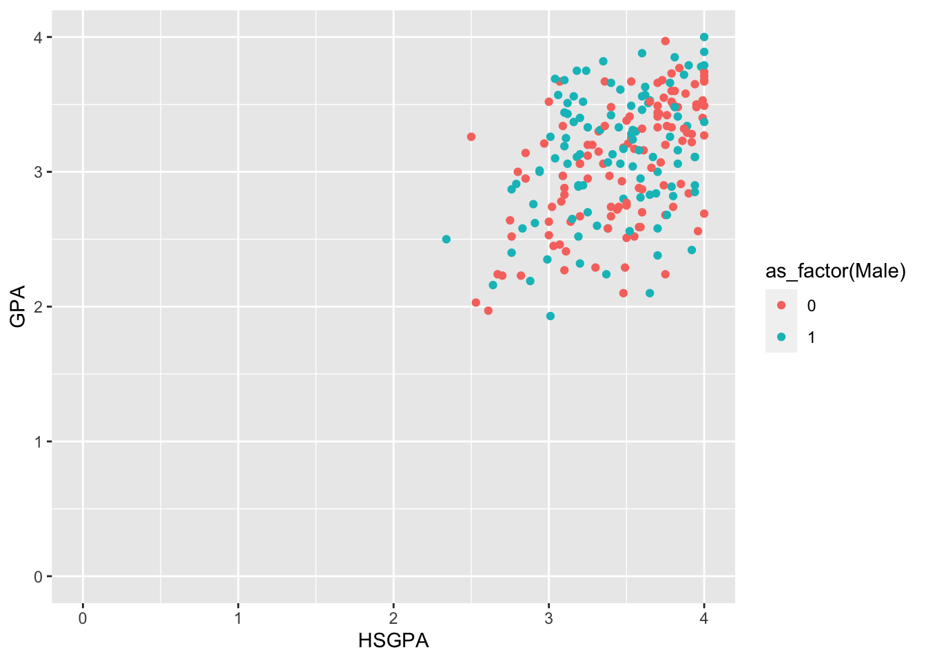
You can also do this using the scale() functions:
ggplot(data = FirstYearGPA) +
  aes(
    x = HSGPA,
    y = GPA,
    color = as_factor(Male)
  ) +
  scale_x_continuous(limits = c(2, 4)) +
  scale_y_continuous(limits = c(2, 4)) +
  geom_point()
Warning: Removed 3 rows containing missing values or values outside the scale range
(`geom_point()`).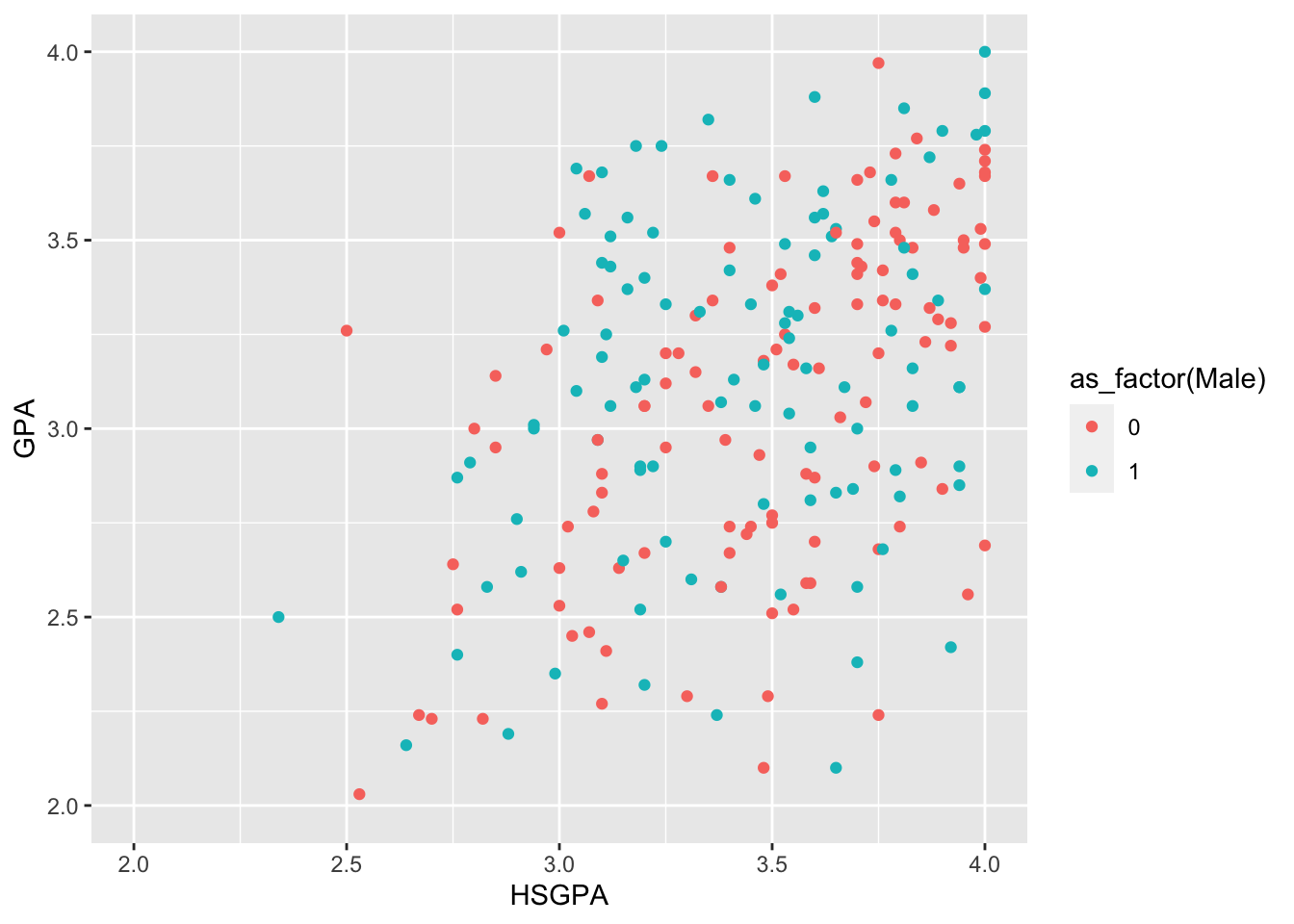
Either way, you can see that the values don’t run the full range of potential values (notice the Warning that R displays). The X axis ranges from 2.34 to 4.0, probably because they collected data from college students (and it’s harder to get into college if you have a very low GPA). Once in college, the GPA limits are a little different. The highest college GPA in the dataset is 4.15 and the minimum is 1.93.
Tip
We can set the limits on allowable data after we inspect the data itself. Helpful functions for setting data limits are min() and max(), or summary(). We will learn more about how to use these functions later, but here’s an example for now: max(FirstYearGPA$GPA). The $ lets us “extract” a column of a tibble.
Legend title and labels
The way to change the legend title is not at all obvious. And there are multiple ways to do it.
The easiest thing to do is use the labs() function, but there’s not an argument that explicitly has to do with the legend. The argument ties back to how you mapped the variable in the original plot. You can also only change the title of the legend with this function, not the labels.
In base_plot_gg, we used color = as_factor(Male) to map discrete color onto the variable Male. So we’ll use color here.
ggplot(data = FirstYearGPA) +
  aes(
    x = HSGPA,
    y = GPA,
    color = as_factor(Male)
  ) +
  # This is a bad label name!
  labs(color = "Sex") +
  geom_point()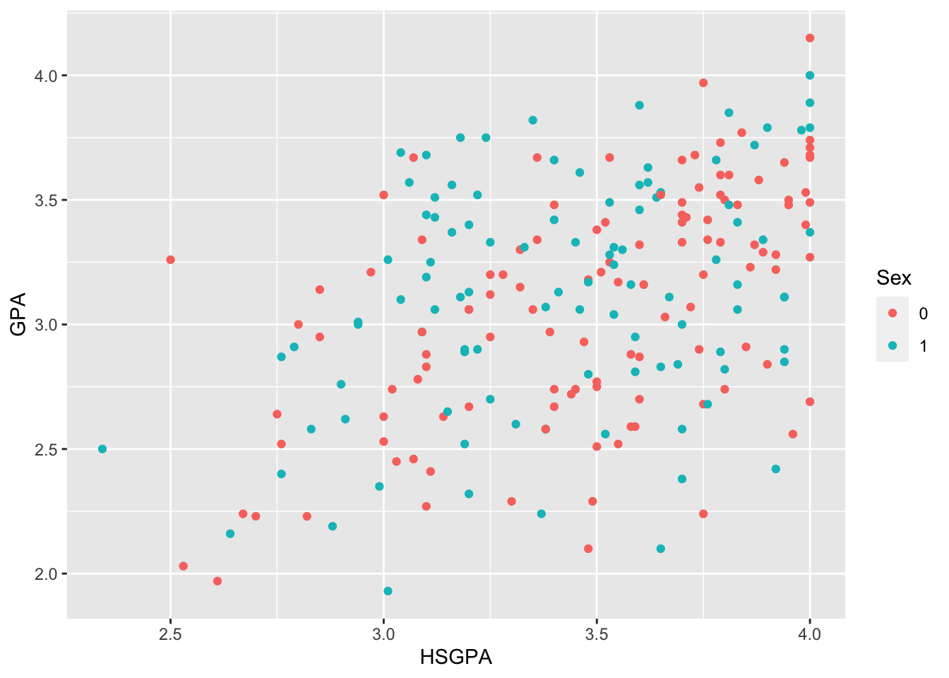
NoteExercise
Exercise
Rebuild the above figure with color = Male instead of color = as_factor(Male). What changed? What kind of information does R think is in the feature Male?
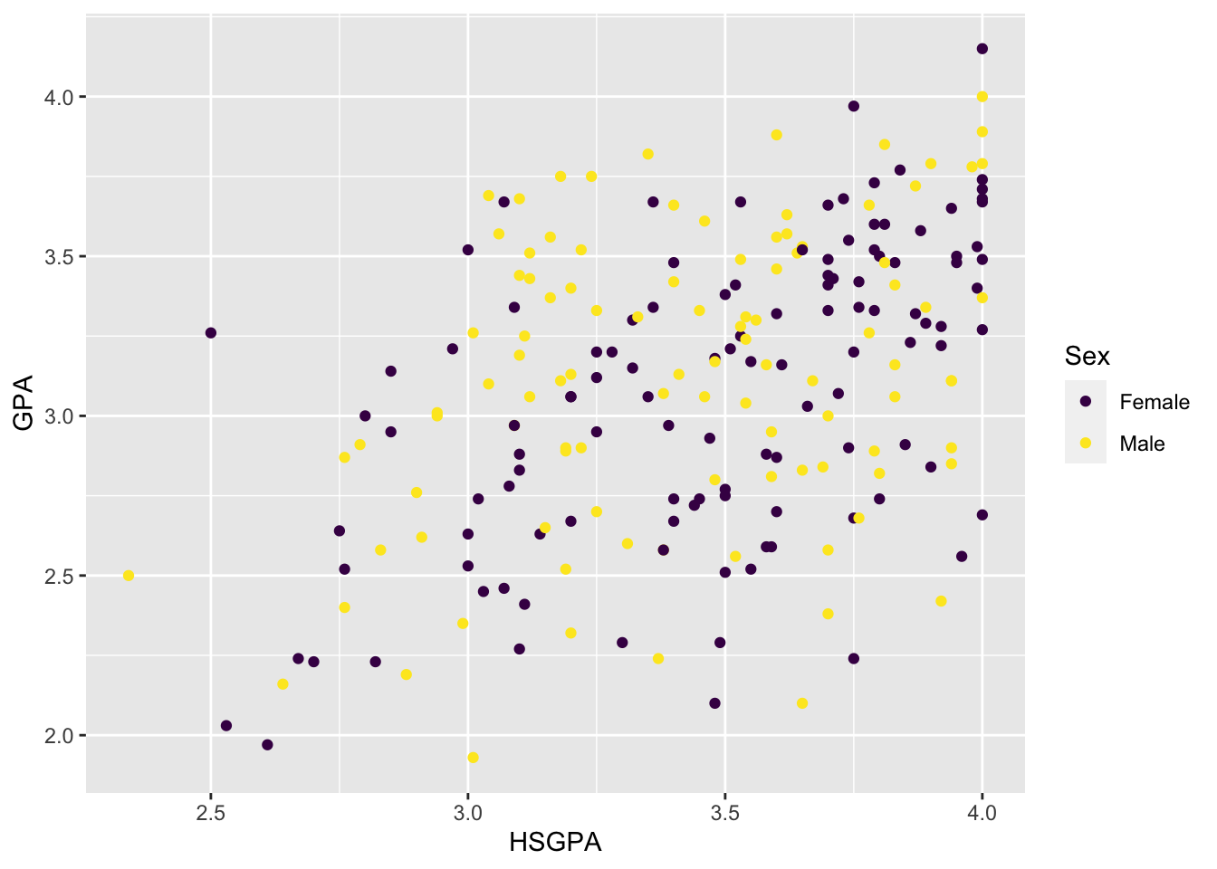
A more general way is to use the scale_color_discrete() function, which allows you to change the title and labels. There are several of these functions, all of the same form:
scale_color_discrete()scale_fill_discrete()scale_linetype_discrete()scale_shape_discrete()scale_size_discrete()scale_alpha_discrete()
Use the appropriate one for your variable type: if you mapped the variable to the fill attribute then use fill; if you mapped the variable to the shape attribute then use shape; etc.
ggplot(data = FirstYearGPA) +
  aes(
    x = HSGPA,
    y = GPA,
    color = as_factor(Male)
  ) +
  scale_color_discrete(
    name = "Sex",
    labels = c("Female", "Male"),
    breaks = c(0, 1)
  ) +
  geom_point()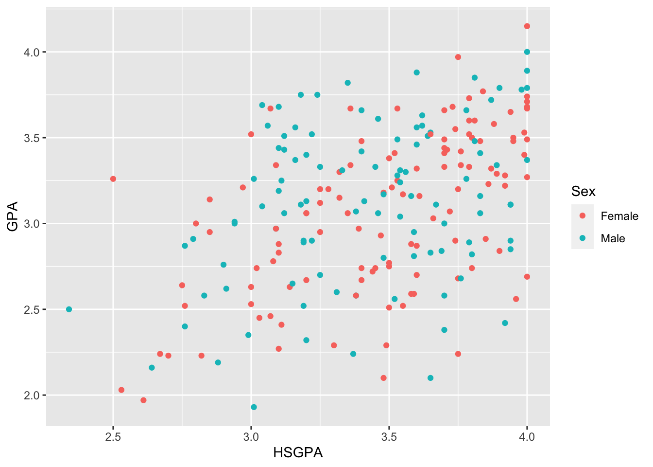
Notice that we supplied the new labels to the feature mapped to color. R will assume that the values given to labels is in alphabetical order. To make sure that the labels match to the right values, we give the feature values in the order matching the labels as the function value to the breaks argument. That is, specifying labels = c("Female", "Male") and breaks = c(0, 1) sets the label for the value 0 in the feature Male to the label "Female" because the order that we used.
Colors
The default colors are fine. They’re easy to distinguish (for me), but they might not work well for someone who is color blind. To change colors, we often chose from a palette.
Color blind friendly color palettes
viridis:: is a widely-used color palette package that has several colorblind-friendly (and black-and-white friendly) color palettes. The vignette for the package, which is kind of the article introducing it and how it works, is here: https://cran.r-project.org/web/packages/viridis/vignettes/intro-to-viridis.html
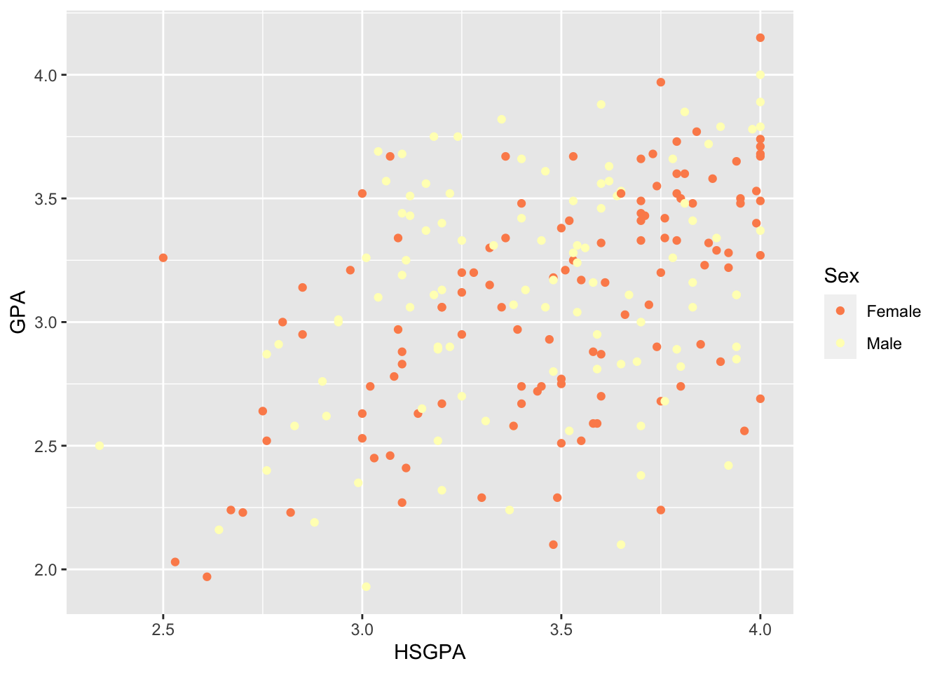
ggplot(data = FirstYearGPA) +
  aes(
    x = HSGPA,
    y = GPA,
    color = as_factor(Male)
  ) +
  scale_color_discrete(
    name = "Sex",
    labels = c("Female", "Male"),
    breaks = c(0, 1)
  ) +
  scale_color_viridis(discrete = TRUE) +
  geom_point()
Scale for colour is already present.
Adding another scale for colour, which will replace the existing scale.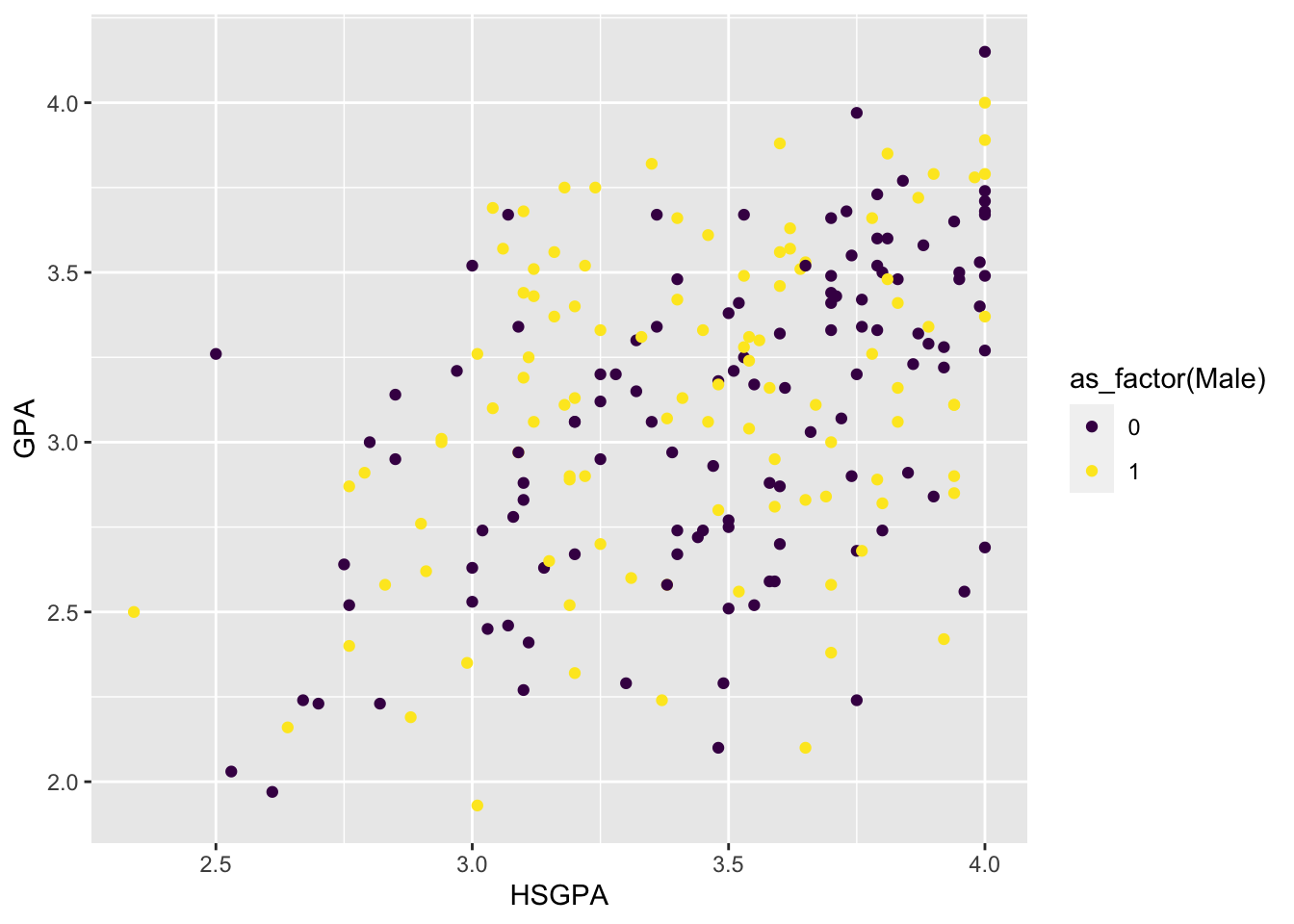
I find this a little hard to see. So maybe not the best choice.
Notice the message:
## Scale for 'colour' is already present. Adding another scale for 'colour',
## which will replace the existing scale.
This means that scale_color_viridis() overwrites scale_color_discrete() that we used above to label the legend. Also notice that the legend title and labels are gone. We can add those arguments back into the scale_color_viridis() function and get them back.
base_plot_gg +
  scale_color_viridis(
    discrete = TRUE,
    name = "Sex",
    labels = c("Female", "Male")
    # I didn't specify breaks = c(0, 1) here because R orders 0 before 1 by
    #   default. This is a "quick and dirty" solution; in practice, you should
    #   always specify breaks whenever you are changing labels (but we won't
    #   be so strict about it for the rest of these examples).
  )
Just pick some colors
You can also just choose some colors from the default ones available in R. Here, I’m using some hex color values, but you can also use RBG or Hex codes or default R ones (i.e, “blue” or “red”). Again, I’m adding the legend arguments back to this function.
base_plot_gg +
  scale_color_manual(
    values = c("#999999", "#E69F00", "#56B4E9"),
    name = "Sex",
    labels = c("Female", "Male")
  )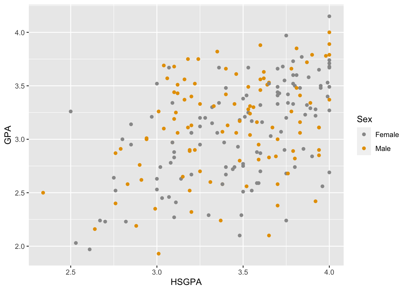
For a plot that uses the fill() option (like a bar plot), the command is fill_color_manual().
NoteExercise
Exercise
This plot uses 3 colors (orange, grey, and blue), but we don’t see blue. Why not?
Some other color palettes
The RColorBrewer:: package has several pre-built color palettes that you can use. You can view all the RColorBrewer:: palettes using
display.brewer.all()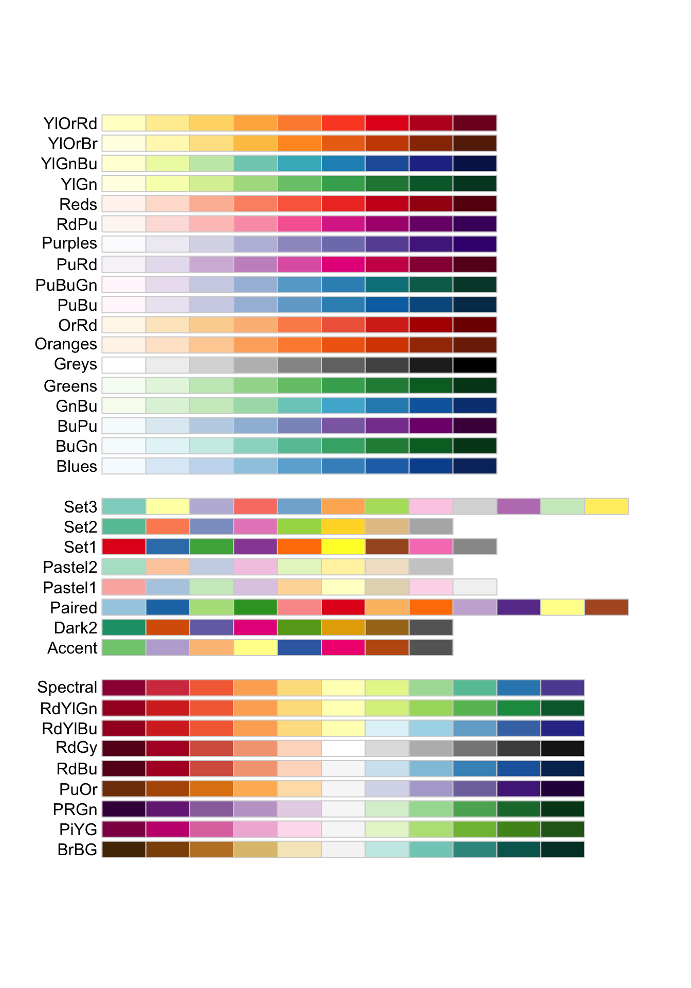
Here are just the palettes that work for people with colorblindness:
display.brewer.all(colorblindFriendly = TRUE)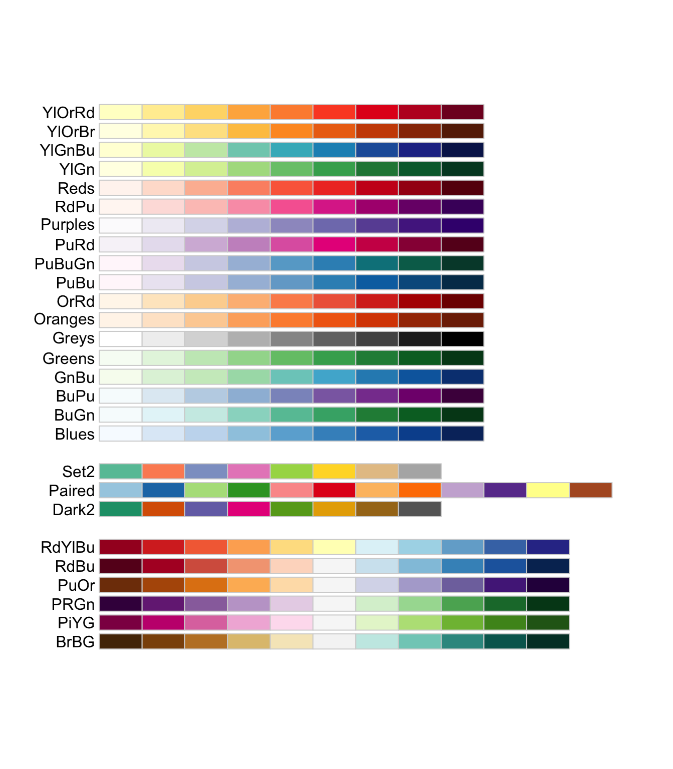
This is a qualitative palette, meaning that it works for nominal type variables. Let’s build our figure again, adding the legend arguments back:
base_plot_gg +
  scale_color_brewer(
    palette = "Set2",
    name = "Sex",
    labels = c("Female", "Male")
  )
Now we will use a diverging palette that goes from red (Rd) to yellow (Yl) to blue (Bu):
base_plot_gg +
  scale_color_brewer(
    palette = "RdYlBu",
    name = "Sex",
    labels = c("Female", "Male")
  )
This is a sequential palette of blues (more useful if we have an ordered discrete value):
base_plot_gg +
  scale_color_brewer(
    palette = "Blues",
    name = "Sex",
    labels = c("Female", "Male")
  )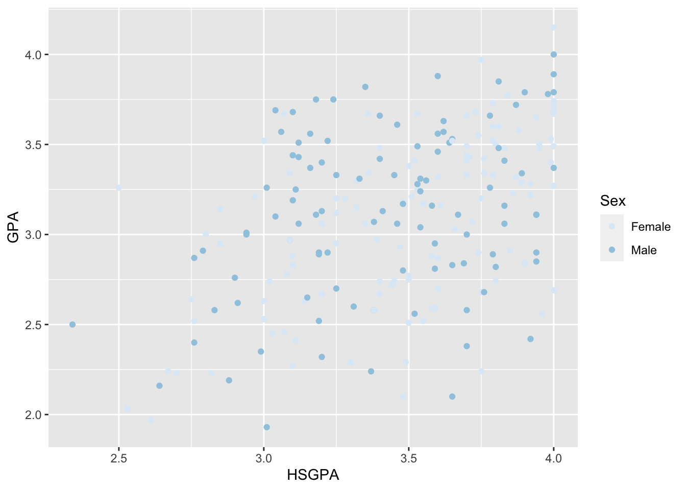
But note that it’s very hard to see the lighter dots on the grey background (we can change this by using theme_*() calls, which we will discuss shortly).
Color based on continuous variable
If you wanted to color based on a continuous variable, you would get many more colors than just the two here. Imagine that, instead of gender, we wanted to color the points based on how many social sciences units they enrolled in (SS in the dataset).
base_plot_cont_gg <-
  ggplot(data = FirstYearGPA) +
  aes(
    x = HSGPA,
    y = GPA,
    color = SS
  ) +
  labs(
    title = "First year college GPA versus high school GPA",
    x = "High school GPA",
    y = "First year college GPA",
    color = "Social studies units"
  ) +
  geom_point()

base_plot_cont_gg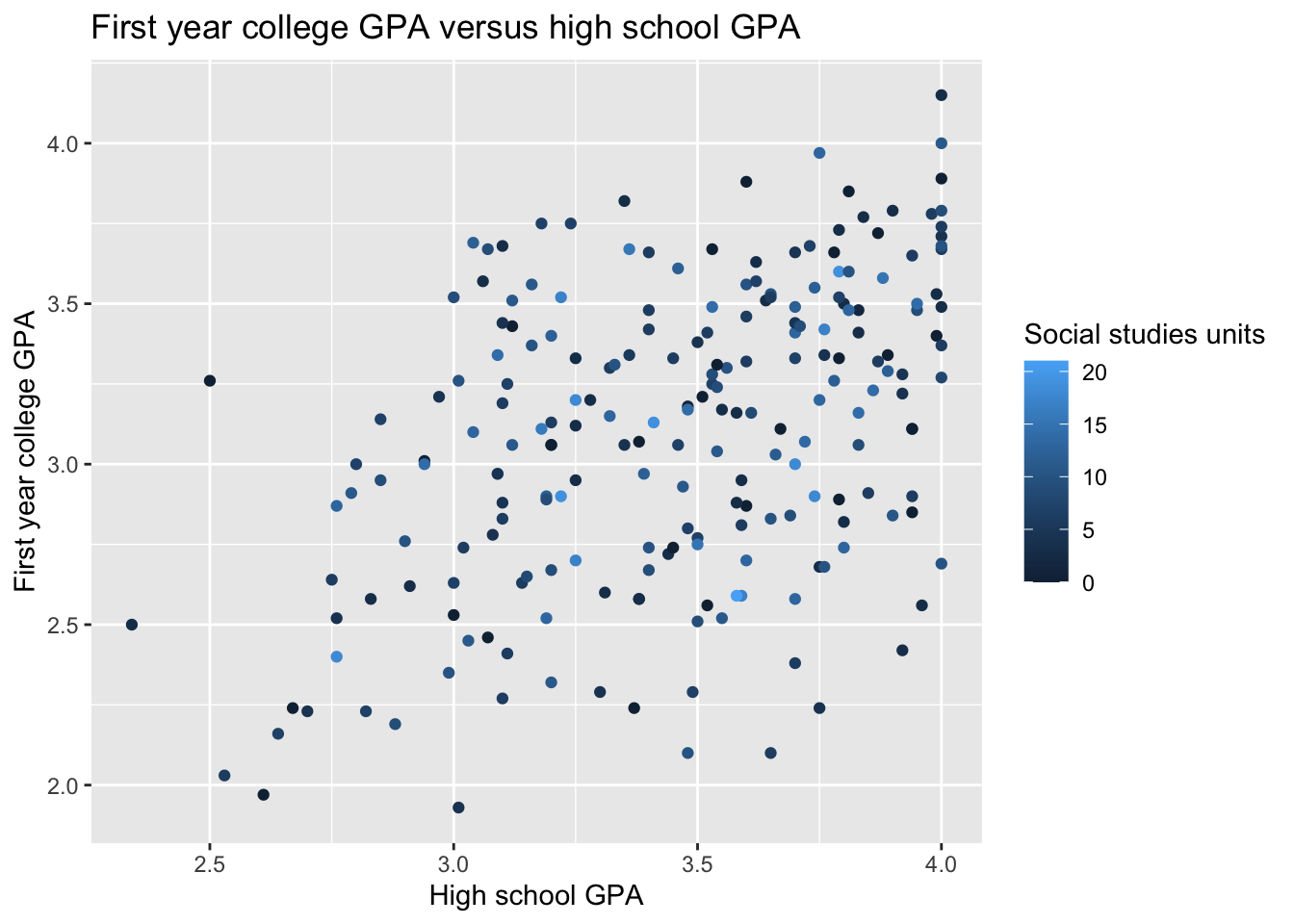
Above is the default color scheme from ggplot. Let’s create a gradient for the SS variable, starting at blue and increasing to red. The function scale_color_gradient() lets you specify just the ends and it fills in between.
base_plot_cont_gg +
    scale_color_gradient(low = "blue", high = "red")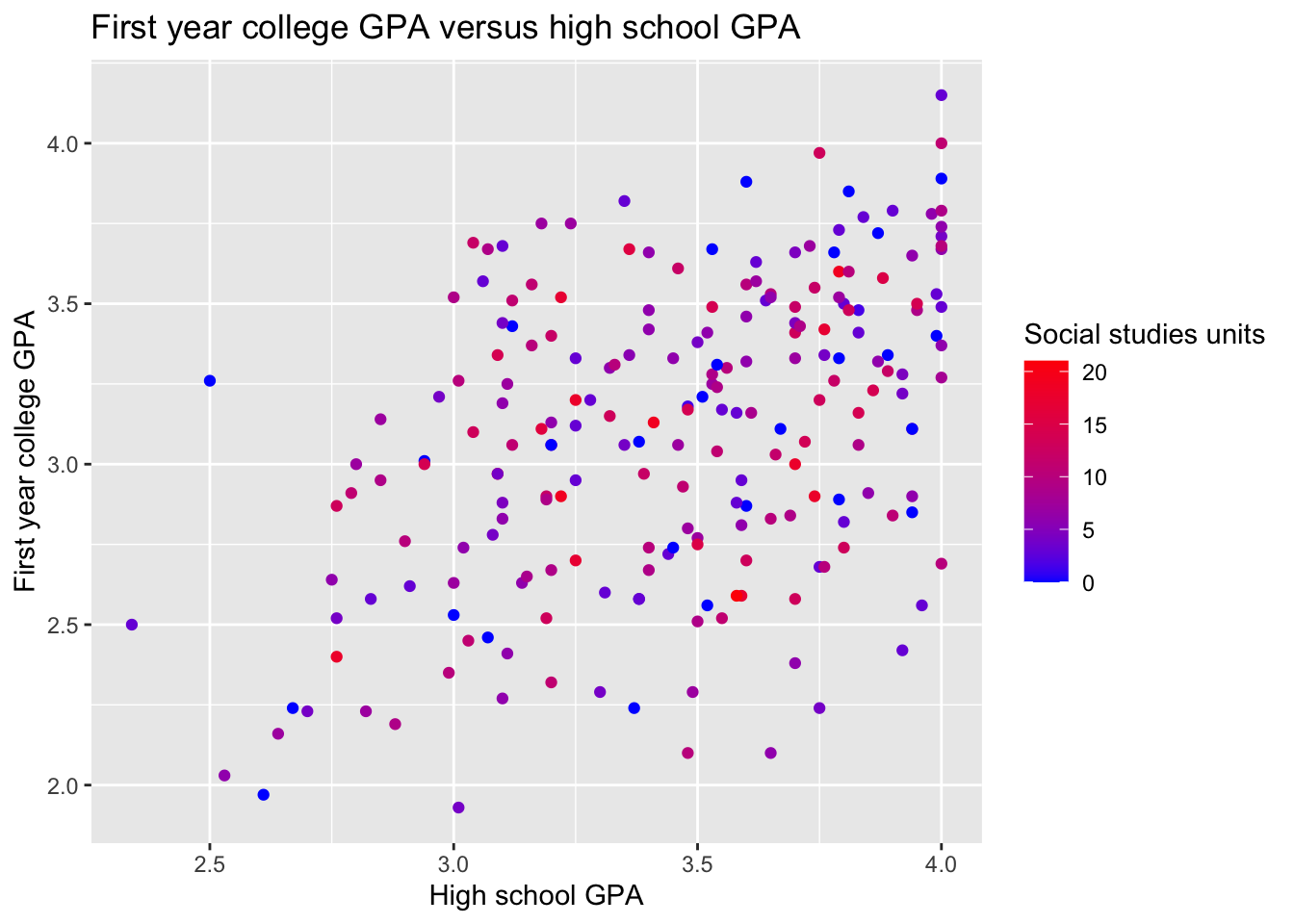
Notice that the continuous variable doesn’t need any edits to the legend labels, so the we don’t have to repeat those options like we did for the plot with the gender variable.
Color fill commands
When you’re using plots that fill rather than create lines or points, the commands are similar but include fill in them. Here is an unedited bar plot that uses one of the RColorBrewer:: color palettes.
ggplot(data = FirstYearGPA) +
  aes(
    x = as_factor(Male),
    fill = as_factor(FirstGen)
  ) +
  scale_fill_brewer(
    palette = "Set2",
    name = "First generation status",
    labels = c("Not 1st gen", "1st gen")
  ) +
  scale_x_discrete(
    name = "Gender",
    labels = c("Female", "Male")
  ) +
  labs(y = "Frequency") +
  geom_bar(position = "dodge")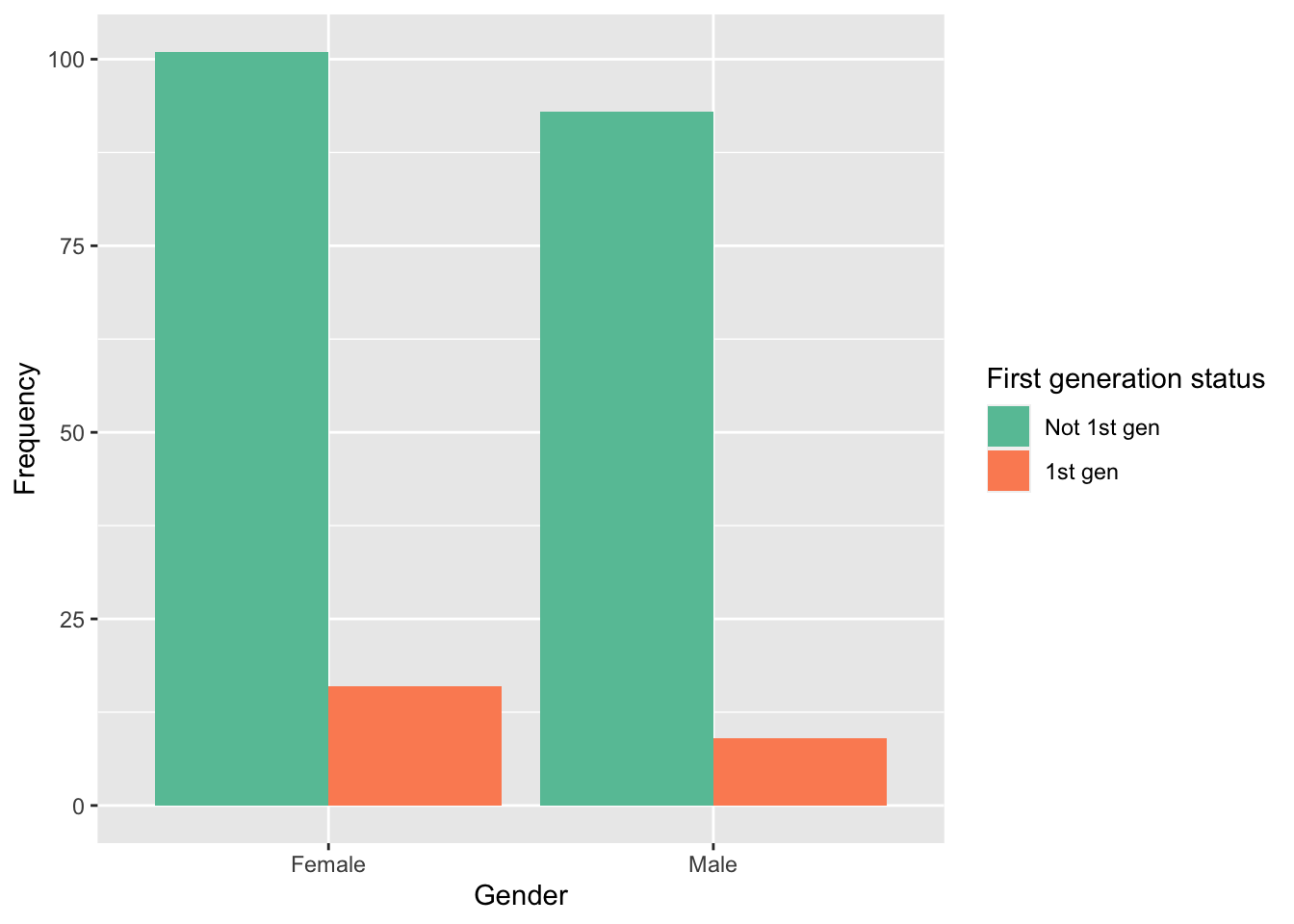
Notice that I added labels to the (discrete) X axis and (continuous) Y axis too.
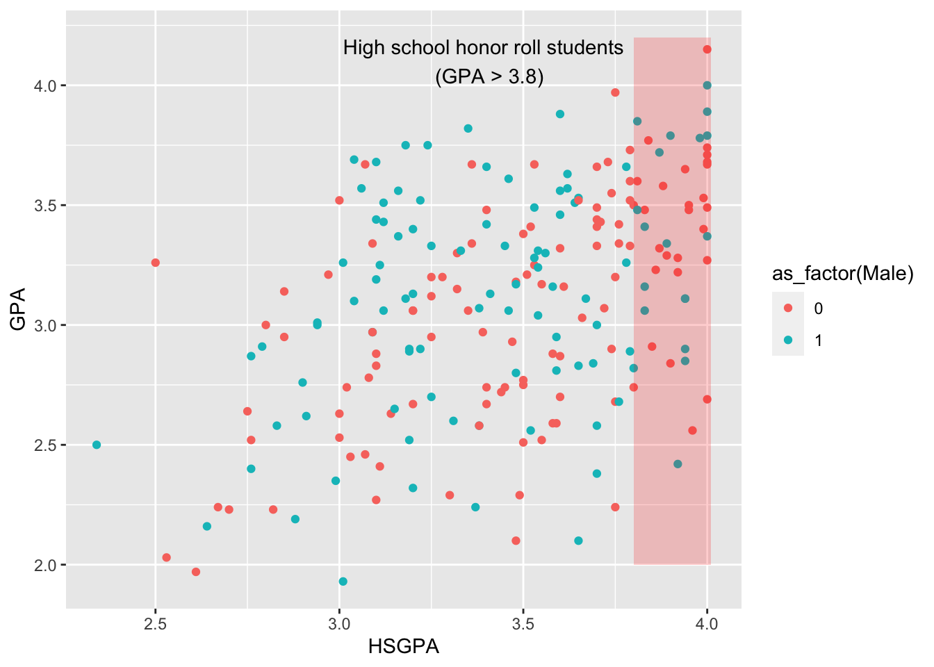
Adding annotations
Let’s return to our base plot of first year college GPA versus high school GPA. We can add annotations to the plot to make things more clear or to point out specific aspects of the plot. For example, we can highlight the area of the plot that includes high school honor roll students (those with GPA > 3.8).
base_plot_gg +
  annotate(
    geom = "rect",
    xmin = 3.8,
    xmax = 4.01,
    ymin = 2.0,
    ymax = 4.2,
    fill = "red",
    alpha = 0.2
  ) +
  annotate(
    geom = "text",
    x = 3.4,
    y = 4.1,
    label = "High school honor roll students \n (GPA > 3.8)"
  )
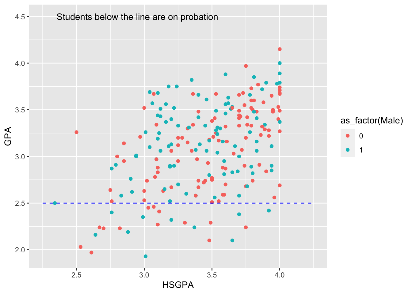
This is pretty basic and built in as an annotation. What about a line indicating college academic probation?
base_plot_gg +
  annotate(
    geom = "segment",
    x = 2.25,
    xend = 4.25,
    y = 2.5,
    yend = 2.5,
    linetype = "dashed",
    color = "blue"
  ) +
  annotate(
    geom = "text",
    x = 2.95,
    y = 4.5,
    label = "Students below the line are on probation"
  )
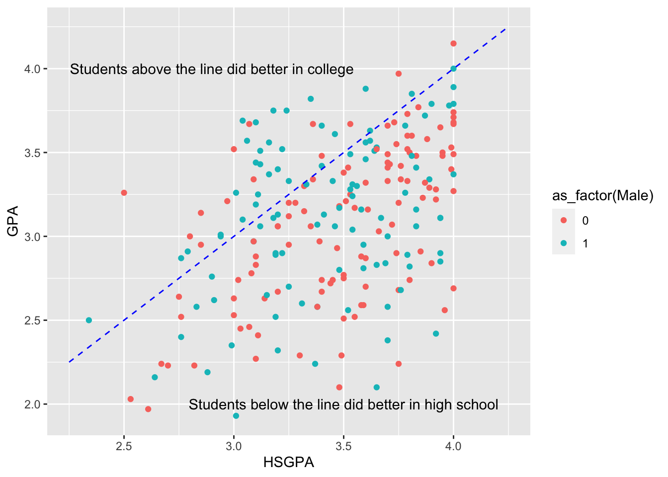
We can add a line indicating equal GPAs in high school and college and add text explaining why that line is important.
base_plot_gg +
  annotate(
    geom = "segment",
    x = 2.25,
    xend = 4.25,
    y = 2.25,
    yend = 4.25,
    linetype = "dashed",
    color = "blue"
  ) +
  annotate(
    geom = "text",
    x = 3.5,
    y = 2,
    label = "Students below the line did better in high school"
  ) +
  annotate(
    geom = "text",
    x = 2.9,
    y = 4.0,
    label = "Students above the line did better in college"
  )
Another use of the line segment could be to indicate which groups are significantly different from one another in a bar plot.
ggplot(data = FirstYearGPA) +
  aes(
    x = Male,
    fill = as_factor(FirstGen)
  ) +
  scale_fill_brewer(palette = "Set2") +
  geom_bar(position = "dodge") +
  annotate(
    geom = "segment",
    x = -0.25,
    xend = 0.25,
    y = 105,
    yend = 105,
    color = "black"
  ) +
  annotate(
    geom = "text",
    x = 0,
    y = 108,
    size = 8,
    label = "*"
  )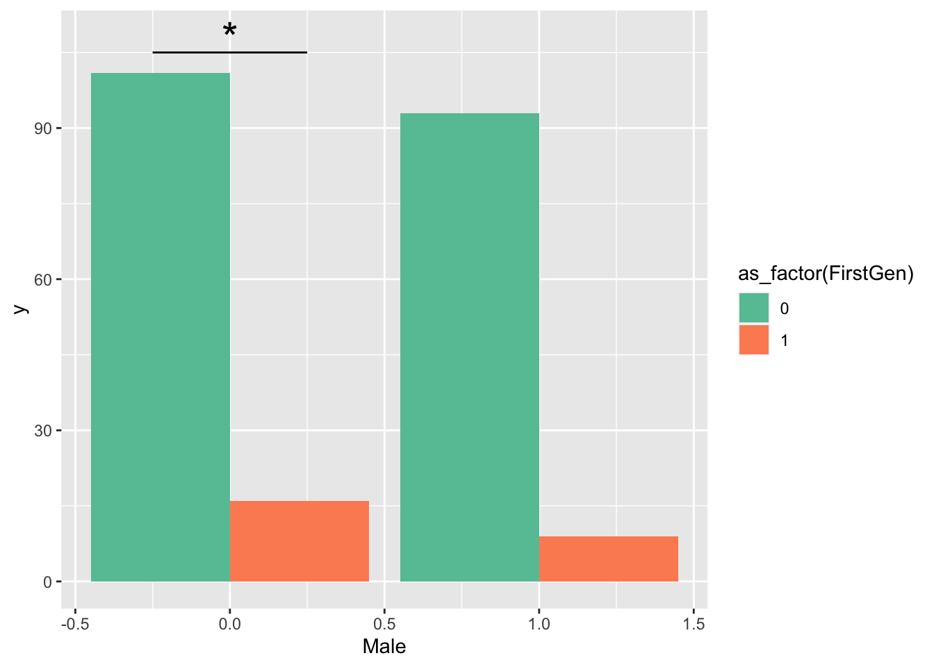
This doesn’t look as good as it could, so let’s clean up the axes and labels.
ggplot(data = FirstYearGPA) +
  aes(
    x = as_factor(Male),
    fill = as_factor(FirstGen)
  ) +
  scale_fill_brewer(
    palette = "Set2",
    name = "First generation status",
    labels = c("Not 1st gen", "1st gen")
  ) +
  scale_x_discrete(
    name = "Sex",
    labels = c("0" = "Female", "1" = "Male")
  ) +
  labs(y = "Frequency")+
  geom_bar(position = "dodge") +
  annotate(
    geom = "segment",
    x = 0.75,
    xend = 1.25,
    y = 105,
    yend = 105,
    color = "black"
  ) +
  annotate(
    geom = "text",
    x = 1,
    y = 108,
    size = 8,
    label = "*"
  )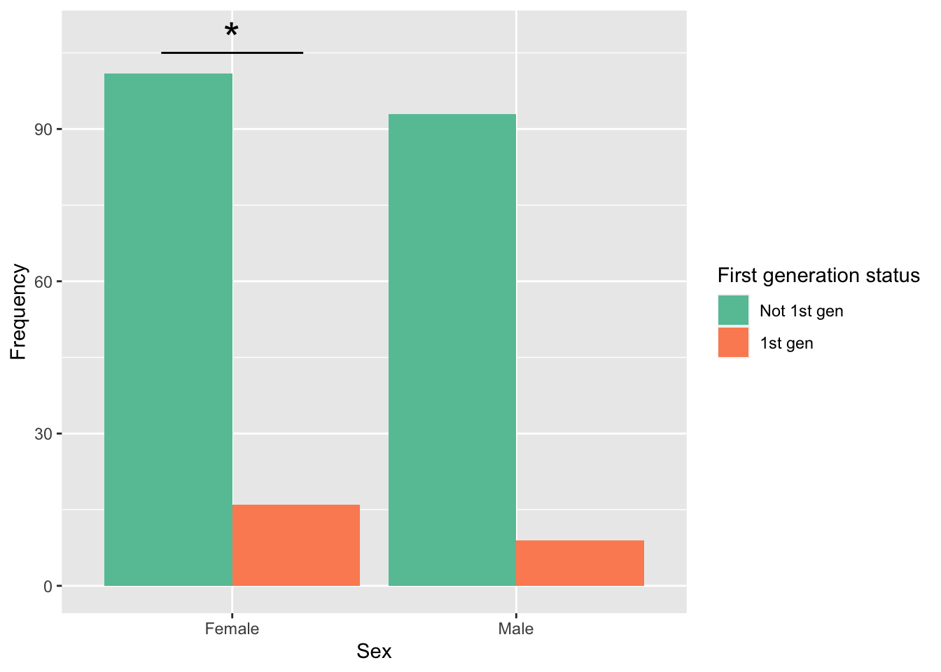
Notice a couple of things here:
- I had to specify that the gender variable was categorical with
as_factor(Male). If I didn’t, the X axis labels won’t show up at all (axis label or category labels). - In
scale_x_discrete(), I specified which category the labels go with:"0" = "Female", "1" = "Male". This is not actually required here becauseRsorts alphabetically, but you should do this by default. - Notice the location of the line and star. I had to adjust their horizontal locations because factors in R do unexpected things: ggplot now places the bars at x = 1 and 2 instead of 0 and 1 because R is interpreting these factors as the numbers 1 and 2. We will discuss this more when we talk about atomic type coercion later this semester.
Themes
We discussed earlier that some of the colors do not appear as clear and vibrant on the grey background. We can change this with themes.
Built-in themes
Here is a simple black and white theme:
base_plot_gg +
  theme_bw()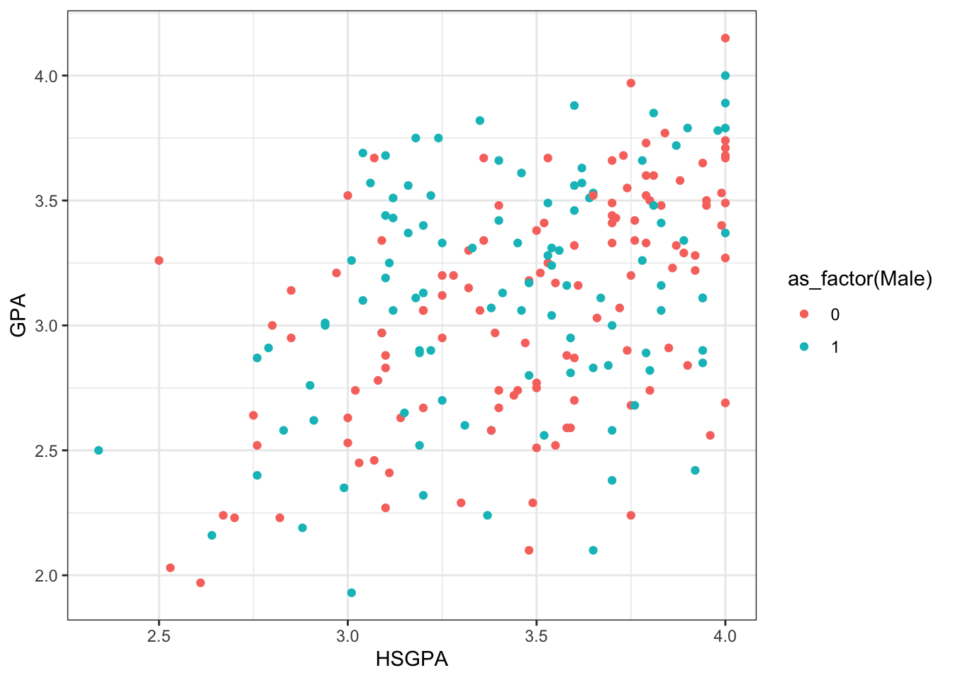
Minimal theme:
base_plot_gg +
  theme_minimal()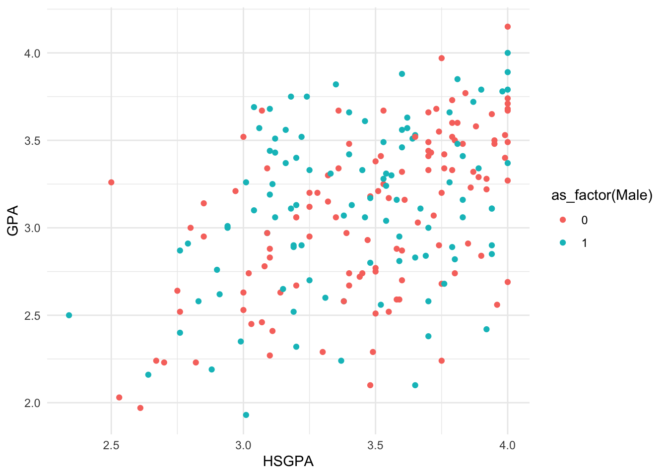
Classic theme:
base_plot_gg +
  theme_classic()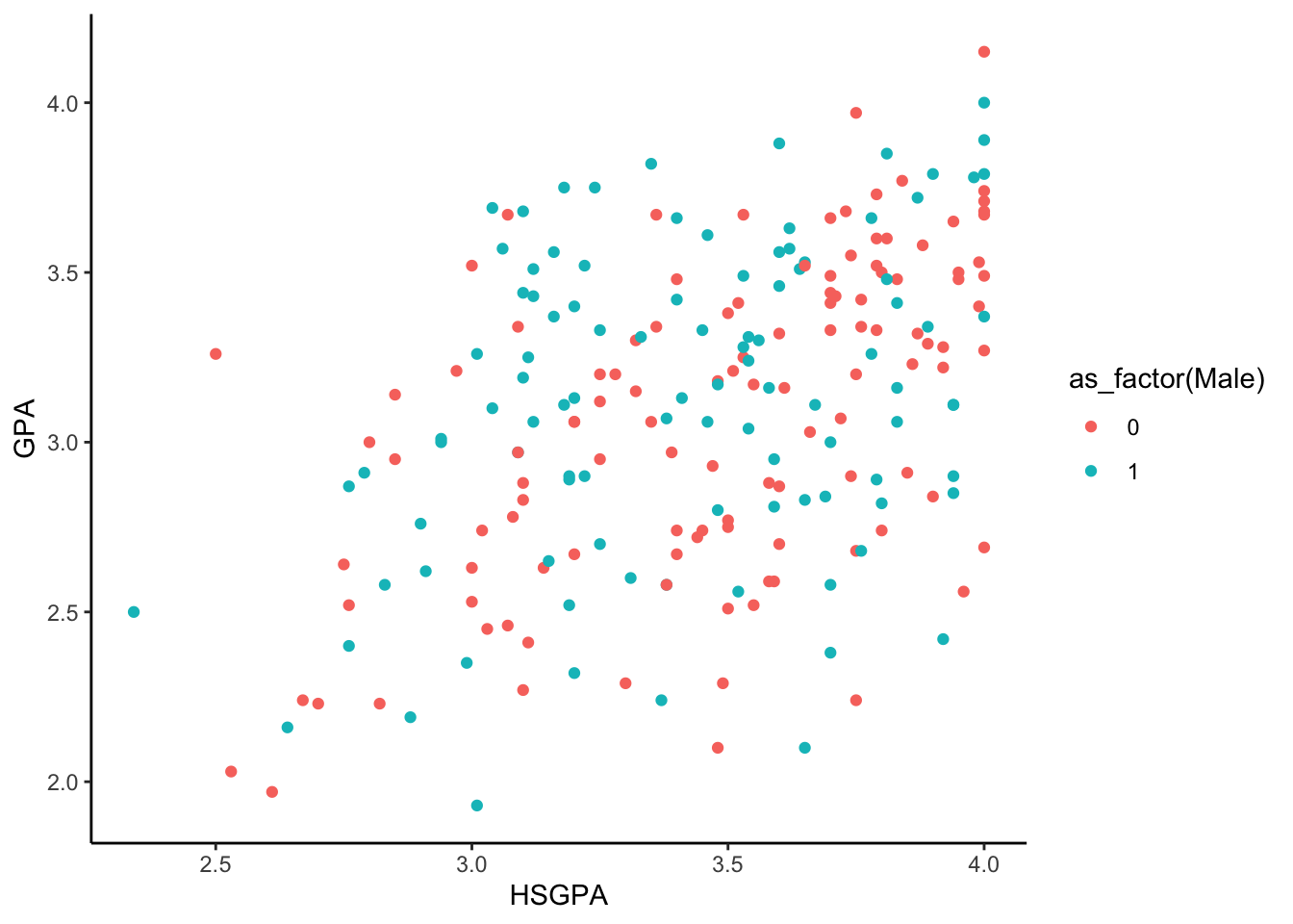
Package themes
There is an APA theme in the jtools package, which was installed and loaded above. As of 2022, it is APA Publication Manual Version 6 compliant.
base_plot_gg +
  theme_apa()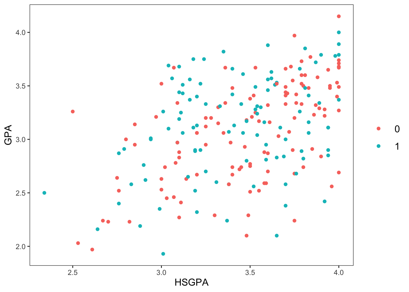
What if I want my plot to look like it could be in the Wall Street Journal? We can get the appropriate theme from the ggthemes package:
base_plot_gg +
  theme_wsj()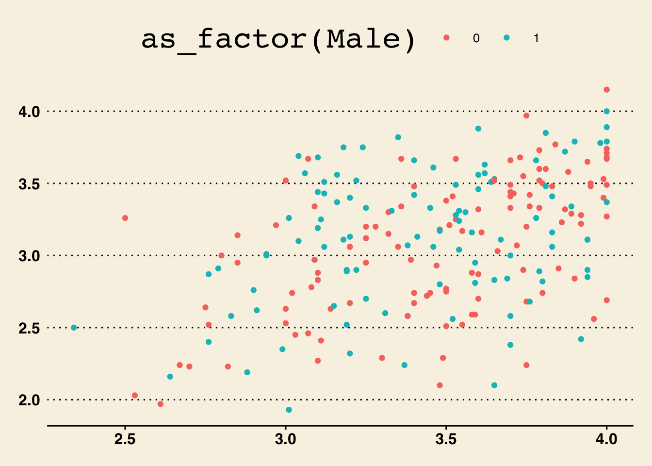
Well, this figure is “maybe not ready for prime time” there. They sure like LARGE titles. Our title has been mostly chopped off.
What about The Economist? (also ggthemes)
base_plot_gg +
  theme_economist()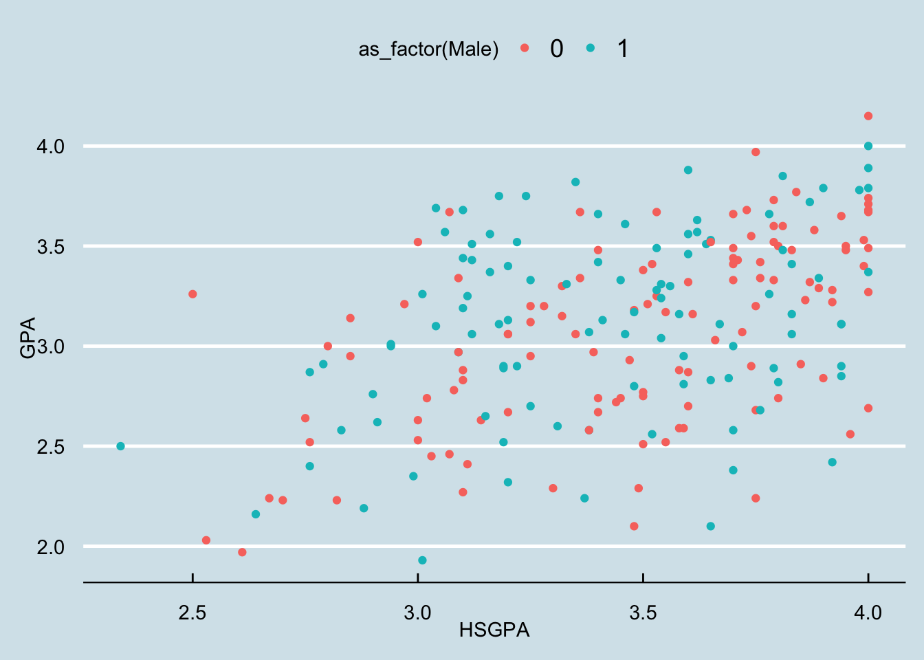
Editing your own theme
You can also change individual parts of the plot yourself. Maybe you just want all the text to be a little larger in a theme. This is good for presentations—the fonts are always a little too small to read well.
base_plot_gg +
  theme_bw(base_size = 16)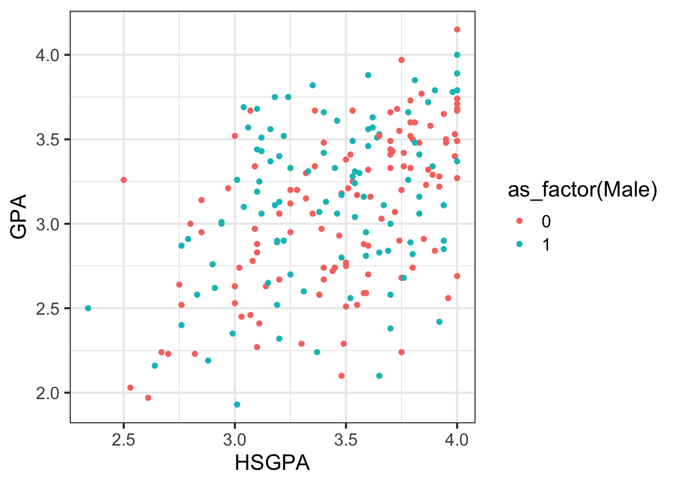
How about changing the background of the plot (and the gridlines) to black to make it really striking?
base_plot_gg +
  theme(
    panel.background = element_rect(fill = "black"),
    panel.grid = element_line(color = "white")
  )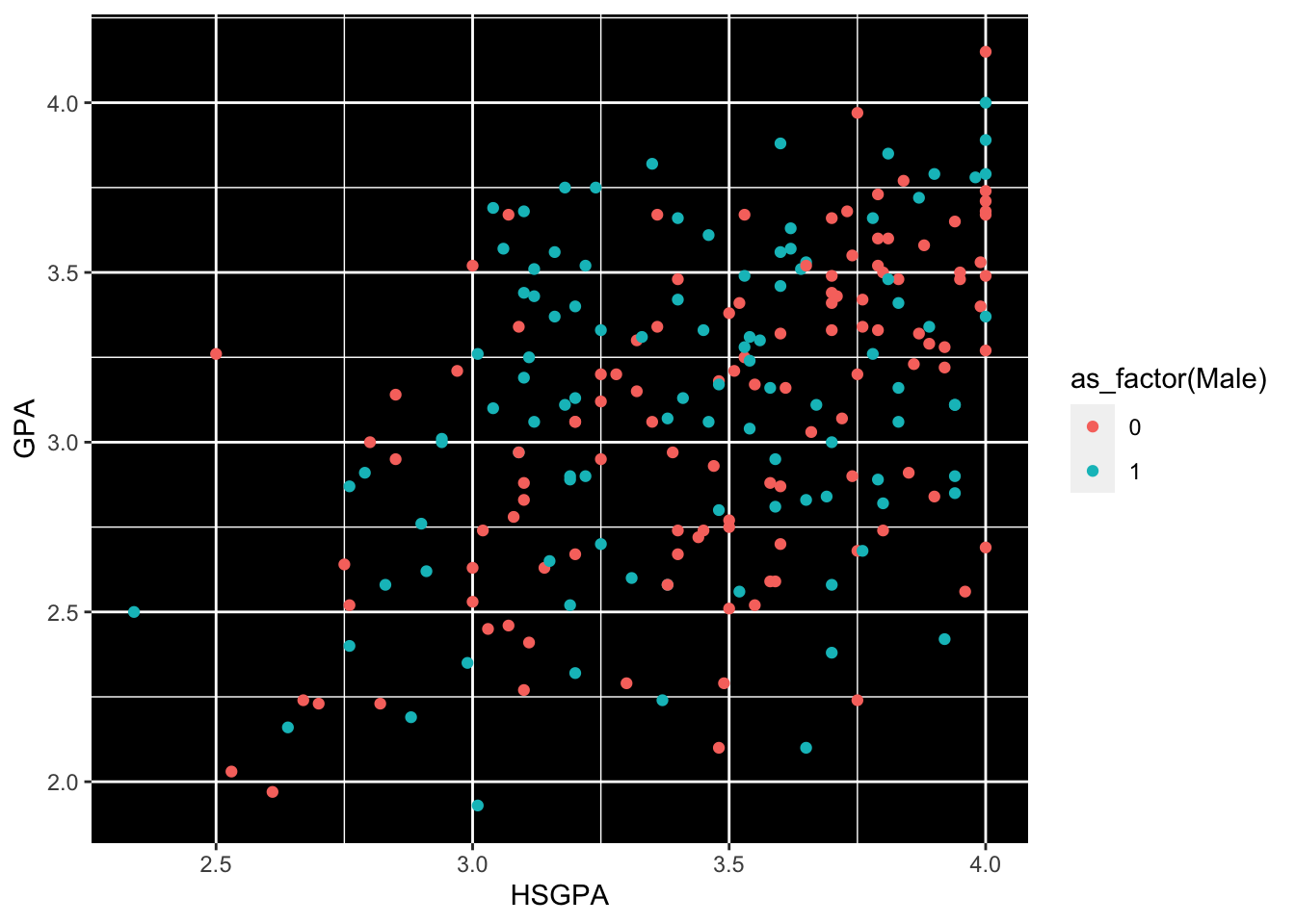
All of the objects you can modify are listed here: https://ggplot2.tidyverse.org/reference/theme.html.
NoteExercises
Exercises
- Change
base_plot_ggto have larger font throughout, purple points for females, green points for males, a white background inside the plot area, and a grey background outside the plot area. Do this layer by layer. Take your time. - Discuss with your neighbour the strengths and weaknesses of this plot. Would you be proud to submit this plot to a journal? What could you do to improve it?