Create a Quarto document with an meme image from the internet (link to the image; don’t download it).
Layered Grammar of Graphics
This section header is quite a lot to unpack (simply considering the English words themselves) even before we discuss the implications in data science. Let’s dive in.
Unpacking the Title
We will start with “graphics”, because most people are most familar with graphs. Then we will work backwards.
Graphics
In computational parlance, a graphic is a visual representation of organized information, displayed to the screen or stored in a file. Consider this picture:
This is a visual representation of information, but it isn’t useful. It isn’t organized, and we cannot draw any meaning from it. The most basic graphic of our data is a screenshot of it, but that usually doesn’t help anyone!
Grammar of Graphics
As we see in the figure above, we need our graphics to follow a set of rules. A grammar is a set of the fundamental principles and rules of a discipline, so the grammar of graphics is the set of fundamental rules for displaying organised information (Wickham, 2010).
A grammar provides a strong foundation for understanding a diverse range of graphics. A grammar may also help guide us on what a well-formed or correct graphic looks like, but there will still be many grammatically correct but nonsensical graphics. This is easy to see by analogy to the English language: good grammar is just the first step in creating a good sentence. - Hadley Wickham
Layering
If grammar helps us construct a sentence in the proper way, layering helps us combine multiple sentences into a paragraph. We use layers to “stack” different levels of results and statistics. Let’s walk through Wickham’s original example (ibid., p. 4).
Example Data
Consider the following toy data:
A
B
C
D
2
3
4
a
1
2
1
a
4
5
15
b
9
9
80
b
A simple research question we may have is, does changing C affect A, and is this effect mitigated by D? To answer this, we would probably build a scatterplot of C and A, with point size, shape, or colour set by D. That is, we assign C to take values on the horizontal axis, A to take values on the vertical axis, and D to take values on some other axis (shape, for instance). The resulting data set looks like this:
x
y
Shape
2
4
a
1
1
a
4
15
b
9
80
b
Now, we are making some progress, but we still haven’t told the computer what to do with this information. Recall that one of the major goals of this class is to help you tell the computer what you want. Your computer needs to translate these points and shape labels into actual pixels on the screen.
Example Data Mapped
Let’s pretend that we give a 200 x 300 window to R to plot these points. The resulting pixel locations and shapes will look like this:
x
y
Shape
25
11
circle
0
0
circle
75
53
square
200
300
square
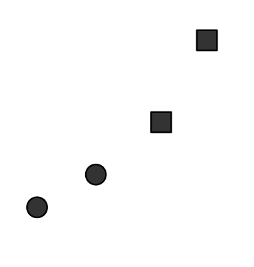
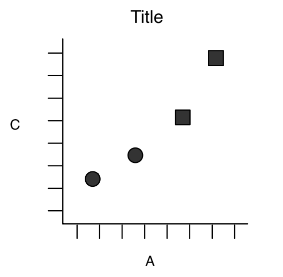
This yields one layer with the overall shape and behaviour of the data:
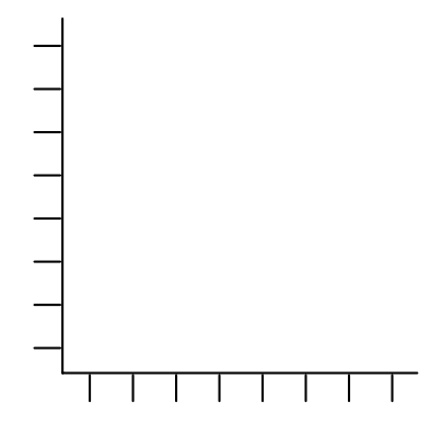
Notice however, that we don’t have any scales for these values. The values R supplied to the computer are in shapes and pixel locations, but we humans can’t interpret what this means. We need another layer for the axes.
Finally, we need a layer for the labels. When we stack these layers (axes, labels, then data), we see the following composed graph:
When we construct figures, we often take for granted the complexity inherent in the task. For our work, we will be constructing figures layer by layer, so it is important to understand these mechanics.
Loading an R Package
In order to make use of the “layered grammar of graphics” in R, we need R to have some additional functionality. As we learned last class, we can make new functionality available for R to use by installing a package to our package library. However, in order to use these packages directly, we need to “check out” these packages from our library.
NoteExercises
Exercises
One of your exercises from last class was to install the tidyverse package. Search through the help file of the install.packages() function you used last class for mention of a package library.
Use the function you find to “check out” (also known as “load”) the tidyverse package from your package library.
The Tidyverse
The Tidyverse is a suite of inter-related packages that make data science in R easier. The components of the Tidyverse are:
ggplot2: make graphs
tibble: create very nice “tidy” data tables from scratch
tidyr: clean “messy” data into “tidy” data
readr: import raw data
purrr: help you modify functions and apply them to your data
dplyr: manipulate “tidy” data tables
stringr: operate on character strings
forcats: recode and modify catagorical variables in R, also known as factors (“forcats” is an abbreviation of for categorical variables, and also an anagram of “factors”)
To be completely honest, we could spend the entire semester on these eight packages. However, we will not be able to do that at this juncture. We are not going to cover the forcats package, we will only briefly mention a function or two from the tidyr package, and we will use some of the time in this semester diving deeper into the “inner workings” of R instead (we will use the Advanced R textbook for that).
My First ggplot
Now that you have an understanding of how the layered grammar of graphics works (in theory), we can build our own plot. Within the tidyverse, there is an example data set on car manufacturing specifics stored in the object mpg (because it is in a package, you won’t see it in the “Environment” pane).
mpg
# A tibble: 234 × 11
   manufacturer model      displ  year   cyl trans drv     cty   hwy fl    class
   <chr>        <chr>      <dbl> <int> <int> <chr> <chr> <int> <int> <chr> <chr>
 1 audi         a4           1.8  1999     4 auto… f        18    29 p     comp…
 2 audi         a4           1.8  1999     4 manu… f        21    29 p     comp…
 3 audi         a4           2    2008     4 manu… f        20    31 p     comp…
 4 audi         a4           2    2008     4 auto… f        21    30 p     comp…
 5 audi         a4           2.8  1999     6 auto… f        16    26 p     comp…
 6 audi         a4           2.8  1999     6 manu… f        18    26 p     comp…
 7 audi         a4           3.1  2008     6 auto… f        18    27 p     comp…
 8 audi         a4 quattro   1.8  1999     4 manu… 4        18    26 p     comp…
 9 audi         a4 quattro   1.8  1999     4 auto… 4        16    25 p     comp…
10 audi         a4 quattro   2    2008     4 manu… 4        20    28 p     comp…
# ℹ 224 more rows
Don’t worry about what this all means for now. Just think of the mpg object as an example of R’s version of an Excel spreadsheet. Observations are in the rows, measurements / variables are in the columns, each column has a name, and each column stores one class / type of data.
There are a few variables in this data set, including
displ: the engine displacement in litres, and
hwy: the highway fuel efficiency in miles per gallon.
NoteExercise
Exercise
Check the definitions and explanations of the other variables in the help file on the mpg object.
Recalling that data science is an intersection of statistics, computing, and domain knowledge, we think about what domain knowledge we have concerning automobiles to create an hypothesis. Some of this domain knowledge comes from our previous courses in physics: we think that engines that are heavier probably aren’t as fuel efficient. We will now test this hypothesis graphically.
Engine Size by Fuel Economy
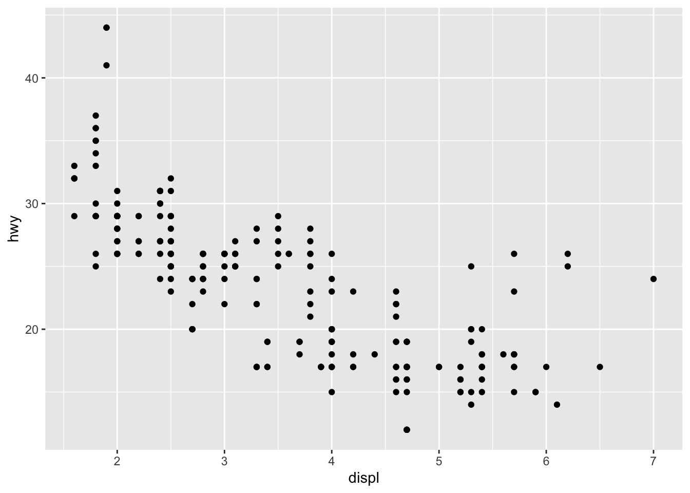
We are going to construct a graph first. I will give you the code and the figure, then we will deconstruct it.
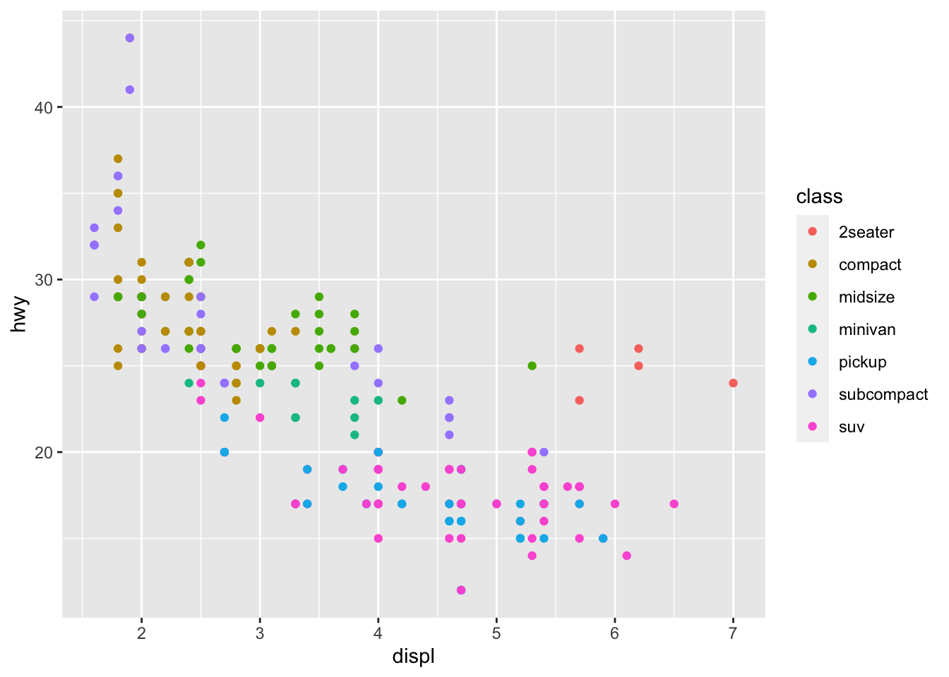
ggplot(data = mpg) +aes(x = displ, y = hwy) +geom_point()
The engine size is on the horizontal axis, the highway fuel efficiency is on the vertical axis, and—at first glance—it certainly seems that larger engines are less fuel efficient.
Within the code itself, the components in this code are organized in a logical manner and with a corresponding set of rules—that is, a grammar. That’s what the gg part stands for—the grammar of graphics.
+: The Layer Glue
Notice that each of the lines above are connected by the plus sign, “+”. In this context, the + symbol operates to “add” layers together, but you can still use it to add numbers too. If you are more familiar with R, but not familiar with the tidyverse, then the idea of “adding” one function to another seems absurd. However, as you’ll see soon, we can “add” more and more layers to a single graph with this + operator.
The data Layer
The first line in the code, ggplot(data = mpg), provides the base layer of the graphic. Recall the function syntax we have learned previously:
The function is named ggplot
The first argument of the function is called data
We supply the data set mpg as the value to this data argument
Think of this as a blank canvas that you will paint on. In this case, the data set mpg provides the material from which to create the canvas.
NoteExercise
Exercise
Run ggplot(data = mpg). What does this plot look like?
The ggplot() function takes data tables only in a certain form; they must have classdata.frame. It’s not important for use to understand what this means right now.
NoteExercise
Exercise
Recall the exercise from Lesson 1 on finding help? We first read about the str function then. Use the str() function to confirm that the mpg object has data.frame as one of its classes.
If you ever have trouble with ggplot(), make sure your data frame is tidy! Later this semester, we will discuss some things to do if your data table is not tidy (using the tidyr, tibble, and readr packages in the tidyverse).
The Aesthetic Mapping Layer
Now that we have created a canvas to paint on, we need to choose our proverbial “colour palette” and plan where our “paint brush” will go. That is, we need to specify which measurements contained in the mpg data set we are going to use, and how they will influence the blank canvas. Now, consider the second line of code: aes(x = displ, y = hwy). Following what we know about function syntax, we can deconstruct this line as follows:
The function is named aes
The first argument of the function is named x
We supply the value of the object displ to the argument x
The second argument of the function is named y
We supply the value of the object hwy to the argument y
Now, if you have been paying attention, you’ll notice that we don’t have any objects named displ or hwy in the “Environment” pane.
NoteExercises
Exercises
Run displ and hwy in the “Console”. What happens?
Run
ggplot(data = mpg) +aes(x = displ, y = hwy)
How is this different from the first layer alone? Remember to use the “+” symbol to add one layer to another.
Where did R find the values for displ and hwy? What would you do if you needed to add different values to the aesthetic layer?
Add 3 and 5 together. Does it still return the number 8 even though 3 and 5 aren’t pieces of a ggplot graph? Discuss with your neighbours.
The Geometric Object Layer
We now have a canvas to plot our points, and a system of axes to know where the points belong. Now we need to tell ggplot()how to plot x and y. This is where the the geom_*() functions come into play: we wanted a scatterplot, so we picked geom_point(). This is simply a call to the function geom_point with no arguments. “Geom” is short for “geometric object”, and there are quite a few geometric shapes we can bend our data into (please see Wickham’s ggplot2 book for more information).
NoteExercises
Exercises
Run the original code (copied below) and compare it to the previous figure. What did the geometric layer add to the plot?
ggplot(data = mpg) +aes(x = displ, y = hwy) +geom_point()
Look up the help manual for the geom_point function. Recall our conversation on functions in Lesson 1. What are some of the arguments for the geom_point function? Where do you think the values of the arguments for this function came from?
Aesthetics and Mapping
The ggplot() function allows us to add variables to a graphic by mapping these variables to aesthetics. In our previous graph, we have already seen two aesthetics: the \(X\) and \(Y\) axes of the scatterplot. We can add a third or fourth variable to a two-dimensional scatterplot using other aesthetics, such as colour or line thickness. The x-axis and y-axis were aesthetics passed through the aes() function on to the ggplot() or geom_point() functions.
Common Aesthetics
There are quite a few aesthetics to choose from to modify our scatterplot:
colour: What color to make our points? Good for continuous and discrete features.
size: How big should the points be? Better for continuous features.
alpha: How opaque / transparent should the points be? Values range from \([0,1]\), with \(1\) being completely opaque. Better for continuous features.
shape: What shape should the points have? Better for discrete features. Options are shown below
fill: For the shapes filled with red, what color should you put instead? Better for discrete features, but is limited when plotting points. The fill aesthetic truly shines with geoms other than point, but that is a bit beyond the scope of this lesson.
For most of these aesthetics, the behavior of the graph will change depending on if you map a discrete or continuous feature to it. For example, if you map a continuous feature to the colour aesthetic, the points will be given a continuous color gradient (by default, from dark blue to light blue). However, if you map character information to the colour aesthetic, the points will be distinctly different (discrete) in color.
Examples
Look back to the figure. You might notice that there is a group of five points on the top right that stick out: these cars have large engines but higher MPG than other vehicles with large engines. We could ask a few questions to try to explain this disparity:
Are these vehicles hybrids?
Do these vehicles use diesel?
Are these vehicles newer?
Each question is a hypothesis, and we will attempt to “test” these hypotheses visually.
Hypothesis 1: Outlier Cars are Hybrids
Check the help documentation for the mpg data set to find out which column measures the type of the car. We probably won’t see “hybrid”” in this list, because we know that very few hybrid cars were in production in both 1998 and 2008. These cars would have all been classified as “compact” or “sub-compact”. Note: this is where “domain knowledge” is critical for proper data science.
Now what type of feature is class? The column header of the mpg data table informs us that this feature is a character feature (chr), and therefore discrete. Thus, we can add it to the graph with the colour or shape aesthetics.
It appears that our hypothesis was incorrect. These vehicles are not small, hybrid cars at all, but “2 seater” cars or midsize cars.
NoteExercise
Exercise
Write the code necessary to create the above graph.
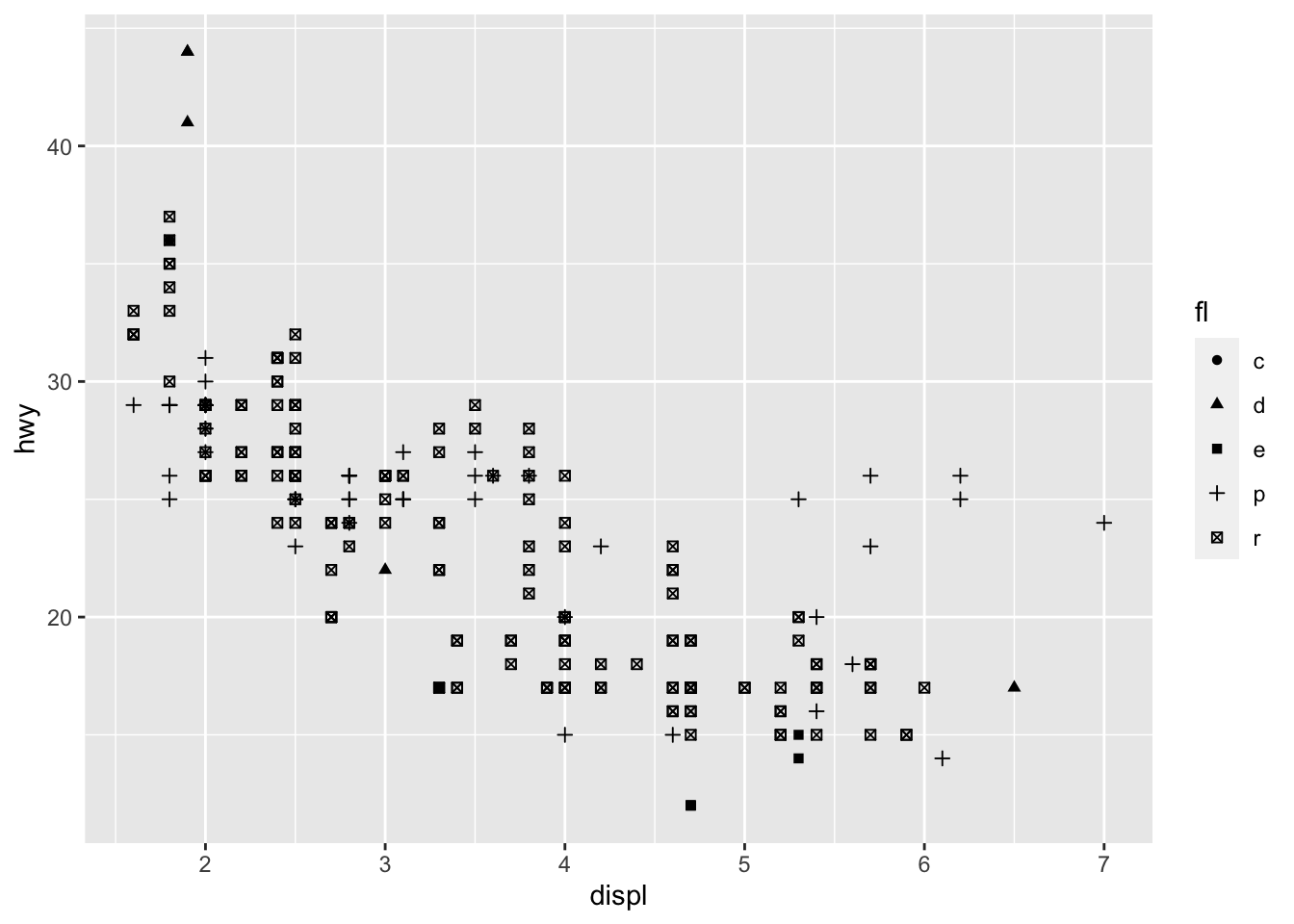
Hypothesis 2: Outlier Cars take Diesel
Our hypothesis is incorrect. It appears that all five of our outlier vehicles take premium fuel (“p”), not diesel (“d”). This graph, when paired with the previous graph on car class, gives us a better understanding of factors that could influence the relationship between engine size and fuel economy.
NoteExercises
Exercises
Using the help manual for the mpg data set, find which feature of the data measures fuel type.
Write the code necessary to create the above graph. Hint: the shape of the points is controlled by the shape argument to the aes() function.
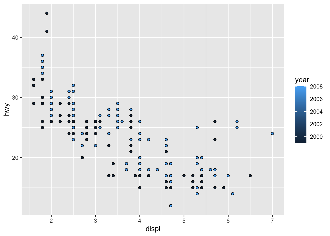
Hypothesis 3: Outlier Cars are Newer
We know that vehicle year can be either 1998 or 2008. Because the manufacture year is a time, we should add it to the graph with the colour, size, fill, or alpha aesthetics.
The manufacture year doesn’t help explain the five outlier points very well. They are rather evenly split between 2000 and 2008.
NoteExercise
Exercise
Write the code necessary to create the above graph. Hint: in this version of the figure, the shape is not dependent on the data, so it is not an aesthetic. Think about where you should put the shape argument if you can’t put it in the aes() function.
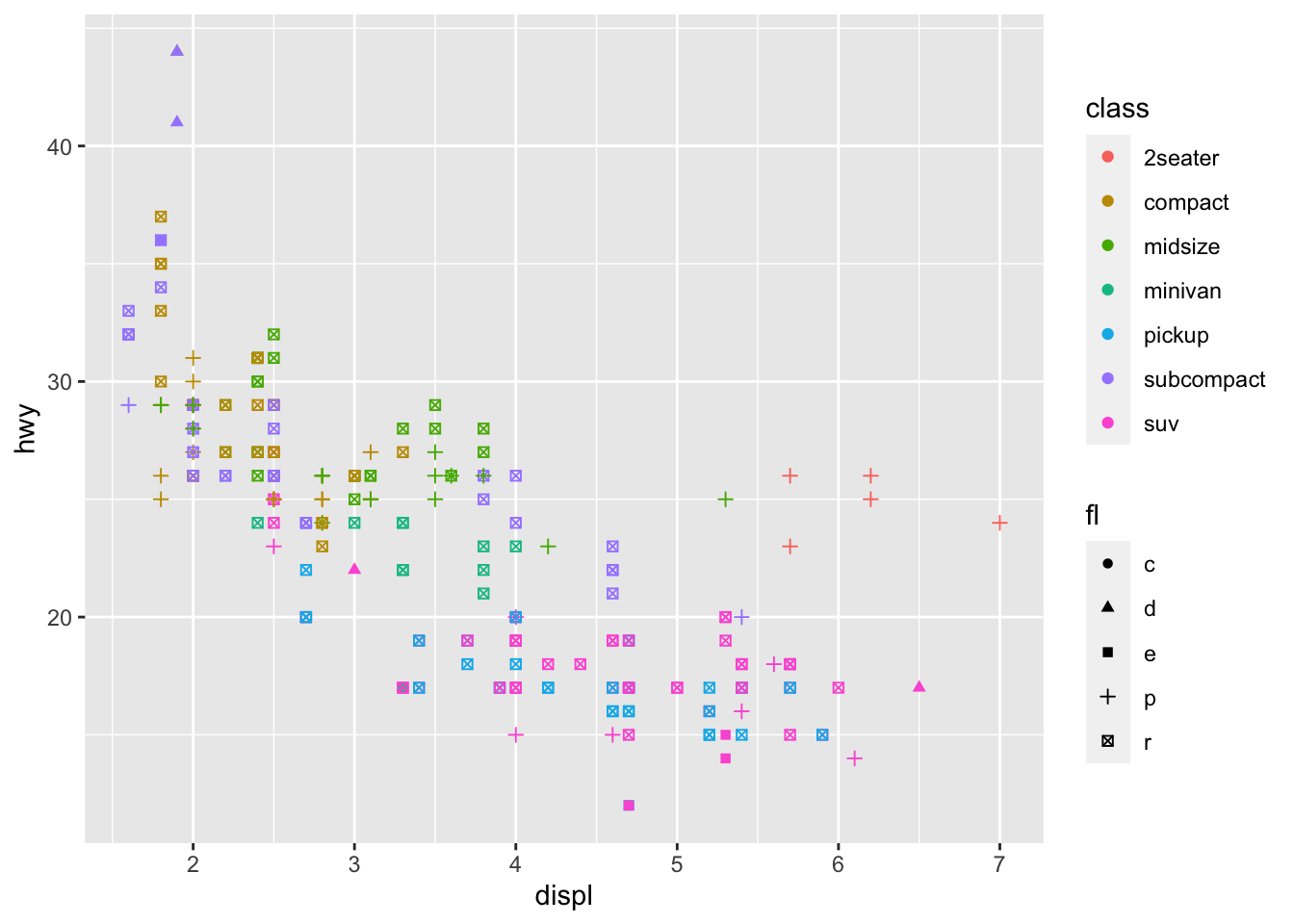
Updated Hypothesis: Outlier Cars are Sportscars
We can add more than 3 features to a plot. Let’s create an engine size by MPG plot with fuel type and car class added.
This looks promising: it appears that all five outliers take premium fuel, and four of the five outliers are 2-seater coupes. This means that our outliers are probably sports / performance cars: larger engines but lighter bodies.
NoteExercise
Exercise
Write the code necessary to create the above graph.
If you’re thinking to yourself, “I wish there was a way to clean this graph up, to only show the premium fuel and two-seater cars”, then you are thinking what I’m thinking. However, we need some functions from the dplyr package first, which we will cover in a few weeks. The ggplot package also gives us a way to break graphs into mutually-exclusive pieces, called facets, which we will discuss shortly.
Geometric Objects
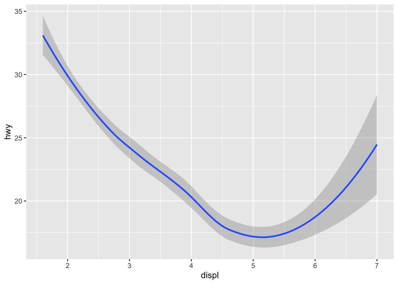
As we mentioned above, there are many geometric objects we can use to plot our data. All of the geometric object functions in the ggplot package start with geom_. Let’s compare two: geom_point() and geom_smooth().
ggplot(data = mpg) +aes(x = displ, y = hwy) +geom_point()
ggplot(data = mpg) +aes(x = displ, y = hwy) +geom_smooth()
Recall from our basic ggplot graph that these two graphs are exactly the same, until the geom_ is added. These two graphs have different purposes, and they tell different messages, but their underlying layers are identical. The only difference is how the displacement and highway fuel efficiency are displayed.
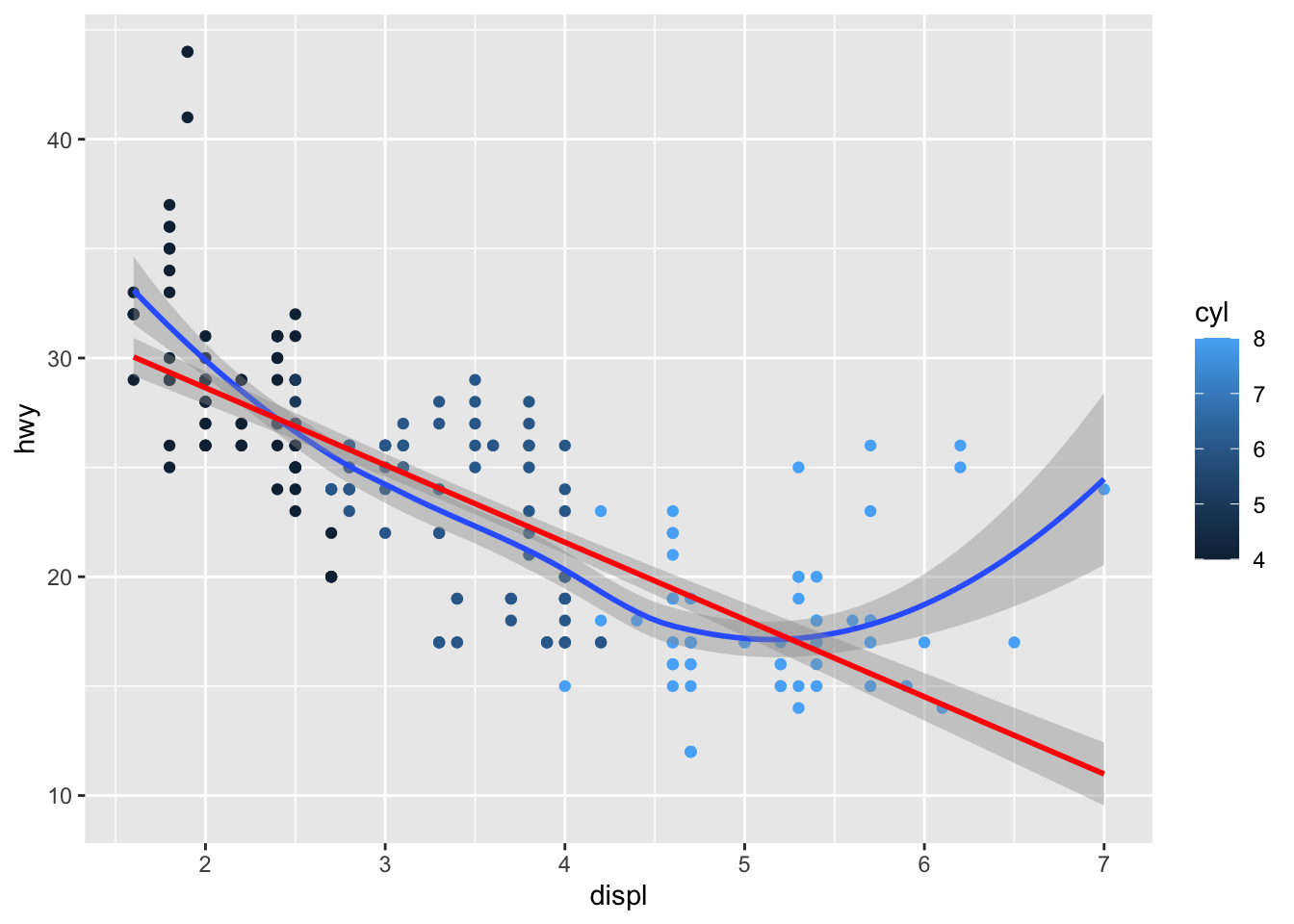
We can also layer geoms on top of each other. Because each layer is doing something different, we can insert code comments in between the lines.
Notice that we are comparing the relationship between engine size and highway fuel economy while accounting for the number of cylinders effect, and overlaying the output from a linear model (red) and a LOESS smoother (blue).
NoteExercise
Exercise
Add comments to the code chunk used to make this graph. Explain what layer each line is adding to the graph, and how they change the output. Hint: you may need to build this graph line-by-line and without function arguments, like we did the first ggplot graph, in order to see all of the changes.
Labelling your Graphs
The last figure was quite complex! It would be nice if we could add another layer to the graph to explain all of the components. Well, with the labels layer (controlled by the labs() function), we can. Most of the labels match the aesthetics that you have supplied either through the aes() function or the geom_*() functions directly. Therefore, some of the arguments to the labs() function are:
title, subtitle: the graphic title and subtitle (above the graphic)
caption: a caption below the graphic
x: label for the \(X\) axis
y: label for the \(Y\) axis
colour, size, alpha, shape, fill, etc.: labels for the other aesthetics
NoteExercises
Exercises
Rebuild the complicated graph above, adding a layer for the title of the graph.
Make the labels for the x, y, and colour aesthetics more professional and presentable
Add a caption that explains the overall relationships visible in the figure.
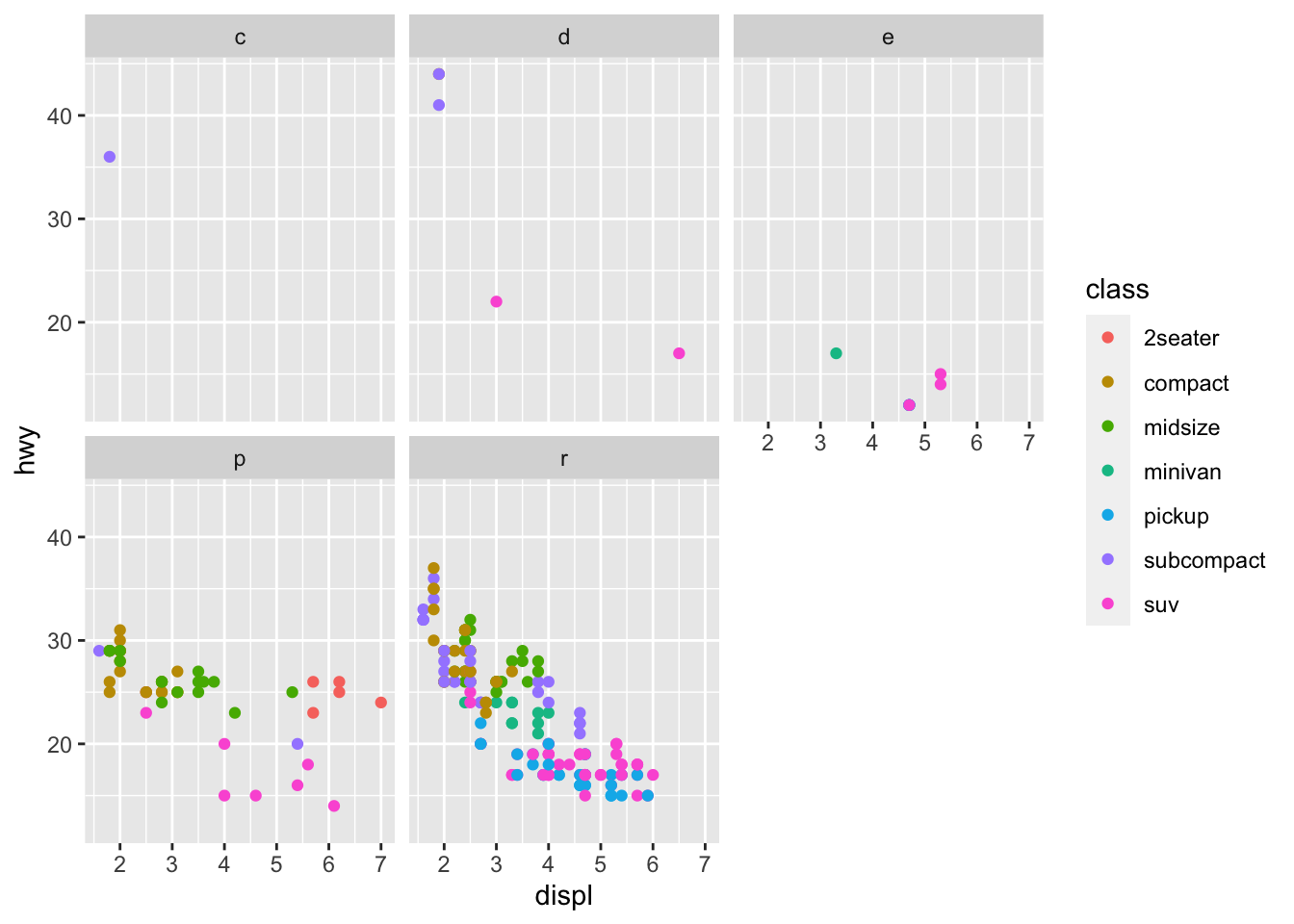
Facets
Facets allow us to split our graphs over a categorical variable. Let’s repeat one of the previous graphs, but split over fuel type (don’t worry about the crazy ~ thing for now).
We see a much stronger negative linear relationship between engine size and fuel economy for vehicles using regular petrol instead of premium. Once again, our dplyr lessons later this semester will cover how to exclude the fuel types other than regular and premium.
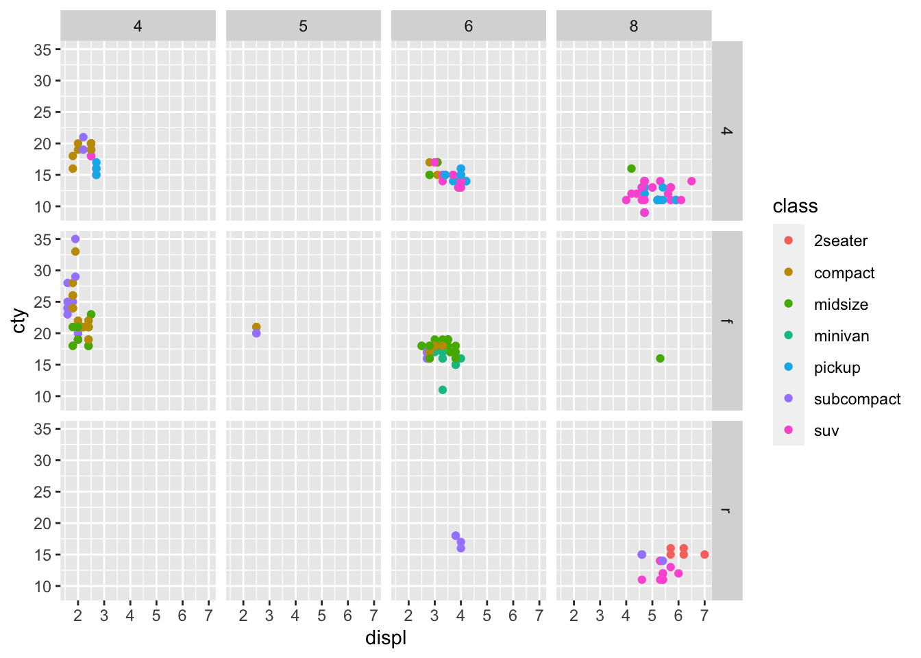
Now what if we wanted facet on two features? Let’s inspect how the number of cylinders in the engine, as well as the drive train, affect the relationship between engine size and city fuel economy.
Discuss the above figure with your neighbours. What information can you draw from this figure? What can be done to improve it? Is this figure useful?
Organizing ggplot Code
Up to this point, we have shown you how to create new layers and add them step-by-step to the “canvas”. In this short section, I want to drive home some best practices for how to order these layers. After all, a nice figure made by poorly-organized code may be more trouble than it’s worth in the long run. Here are the recommended groups for ggplot components.
Tip
Use these layer organization rules to make sure that a later layer doesn’t overwrite something important in an earlier layer. This is one of the most significant pain points for new ggplot users. Keep your layers organized!
The data: keep parts of the code that modify the data itself at the top or near the top. Usually, I will put code to make minor modifications to data sets directly in the ggplot() call.
Aesthetics: any code that controls the overall appearance of the figure (but not what the figure is) should go with aesthetics. This includes:
theme_*() functions (usually at the very top, right after the data layer calls),
aes() mapping, then
limits with *lim(), scales with scale_*(), and labels with labs()
Geometric and Statistical objects: calls to geom_*() or stat_*() go here, as well as modifications to how those geoms are displayed that are independent of the data (such as changes to point transparency or size made simply so the graph is easier to understand)
Facets: facets “multiply” the number of figures you display, so it makes sense to make sure the rest of the figure is set how you like it before you make multiple copies.
These rules may seem arbitrary, but they will help you in the long run. After all, it’s very challenging to paint “a mountain in the background” after you’ve finished the rest of the painting.